Sarofksy’s viral and high-end work brings cinematic title design to the spotlight
Creating a movie or a series is a huge deal, whether it is a short DIY film or a Hollywood blockbuster. Every little detail needs to be taken care of to achieve maximum quality and impress the audience and critics too.
For us typography aficionados, one super important element of cinematography is always the title design. There is a lot of hard work, great history and stylistic evolution when it comes to title sequences. To be fair, it’s the first thing you see and it kind of sets the whole atmosphere and aesthetic of the movie. That is why the first minutes of a film might sometimes include the finest typographic and design elements ever.
Sarofsky: Creativity, Expertise & Elevated Title Design
When we talk about title design, we need to talk about Sarofsky. Located in Chicago, the Sarofsky team considers themselves to be more of a community than a strict design studio. Founded by creative extraordinaire Erin Sarofksy in 2009, Sarofsky grew to be one of the major players in the advertising and the entertainment industry.
This is a cross-media production company that works in projects all over the world, taking over projects in motion design, animation, VFX, edit and finish, or live action and everything in between. However, their work on title design stands out everytime. You will be impressed by the number of movies and series you love that have the Sarofsky signature.
BEEF: The most viral and exciting opening titles Netflix has ever seen
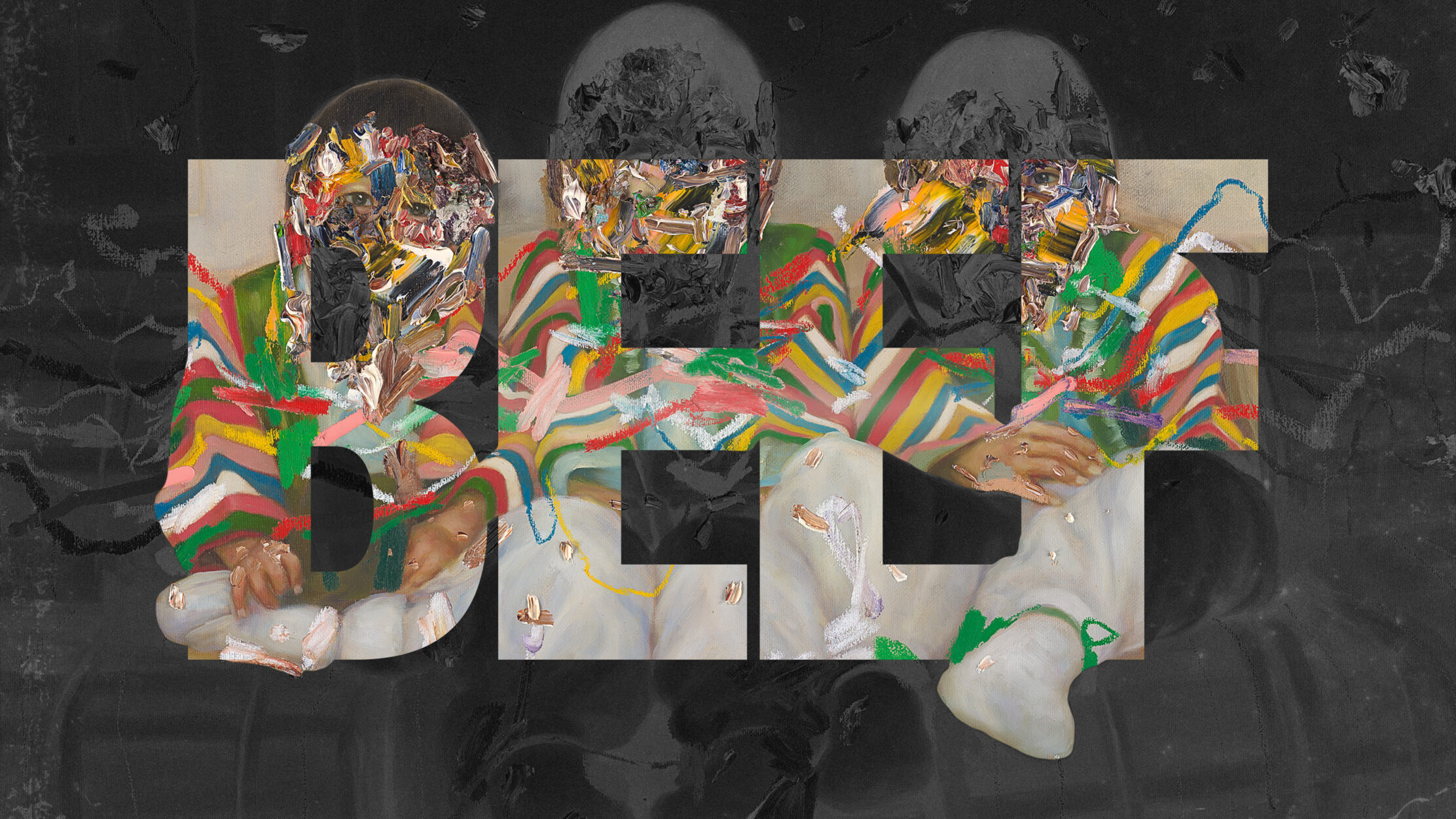
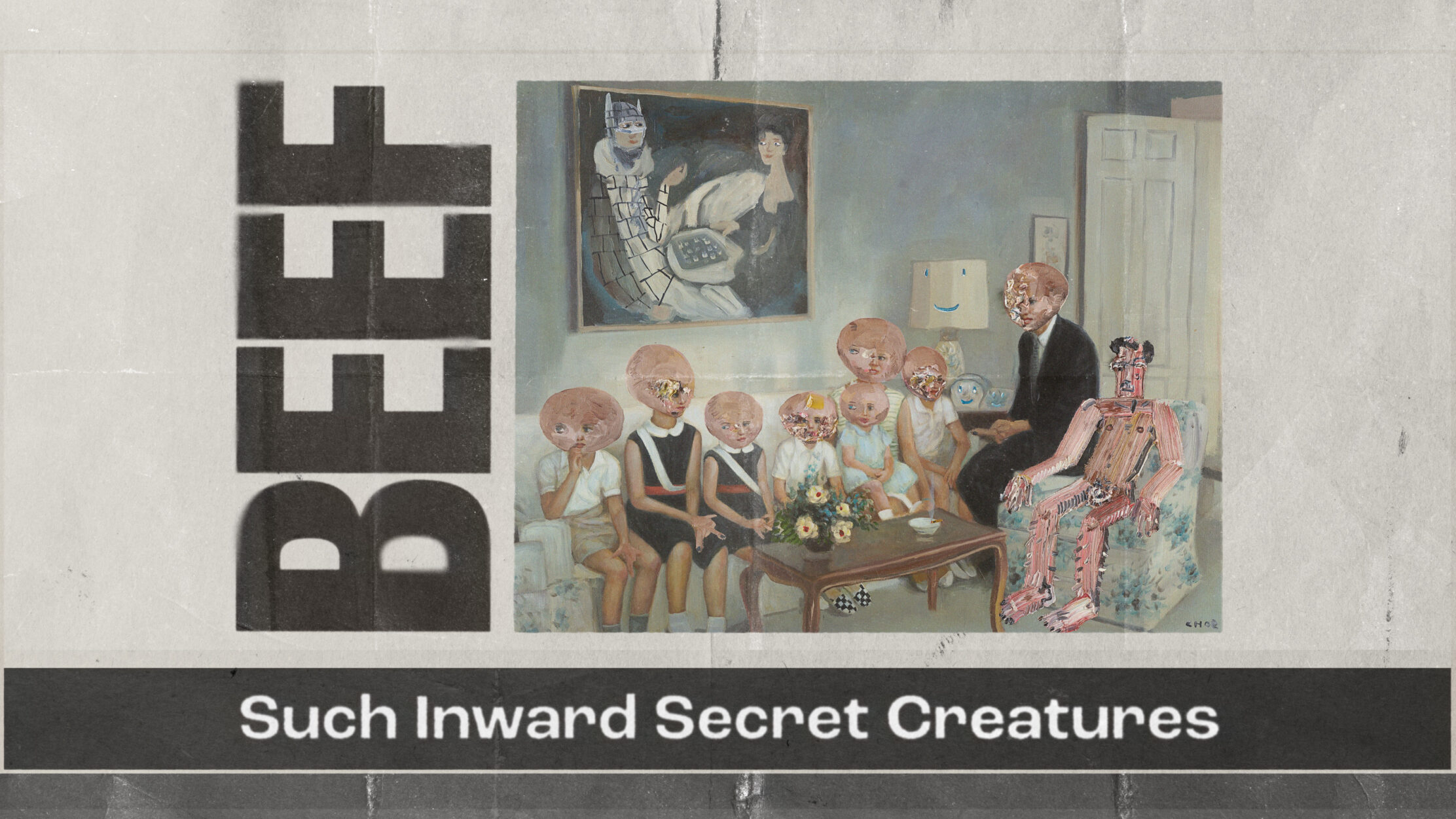
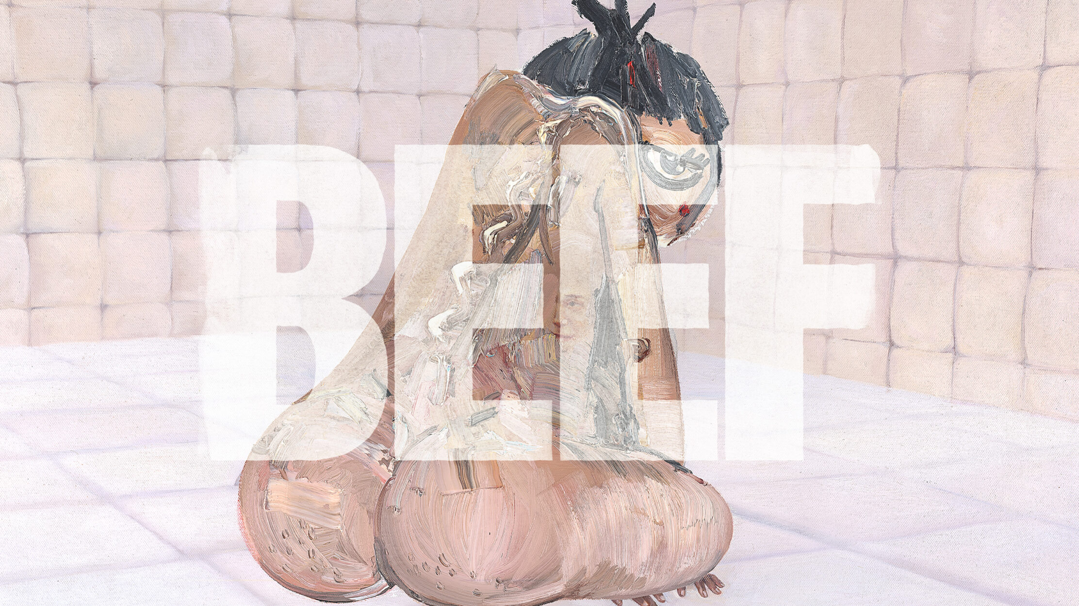
Well, unless you are living under a rock, you probably have heard about BEEF, this year’s hit series by Netflix and A24, a production company known for their eclectic, high-end, contemporary and provocative aesthetics. Starring Steven Yeun and Ali Wong, this series became super successful for the plot, cinematography, photography and direction but everyone was also talking about the impressive, powerful, sometimes disturbing opening titles.
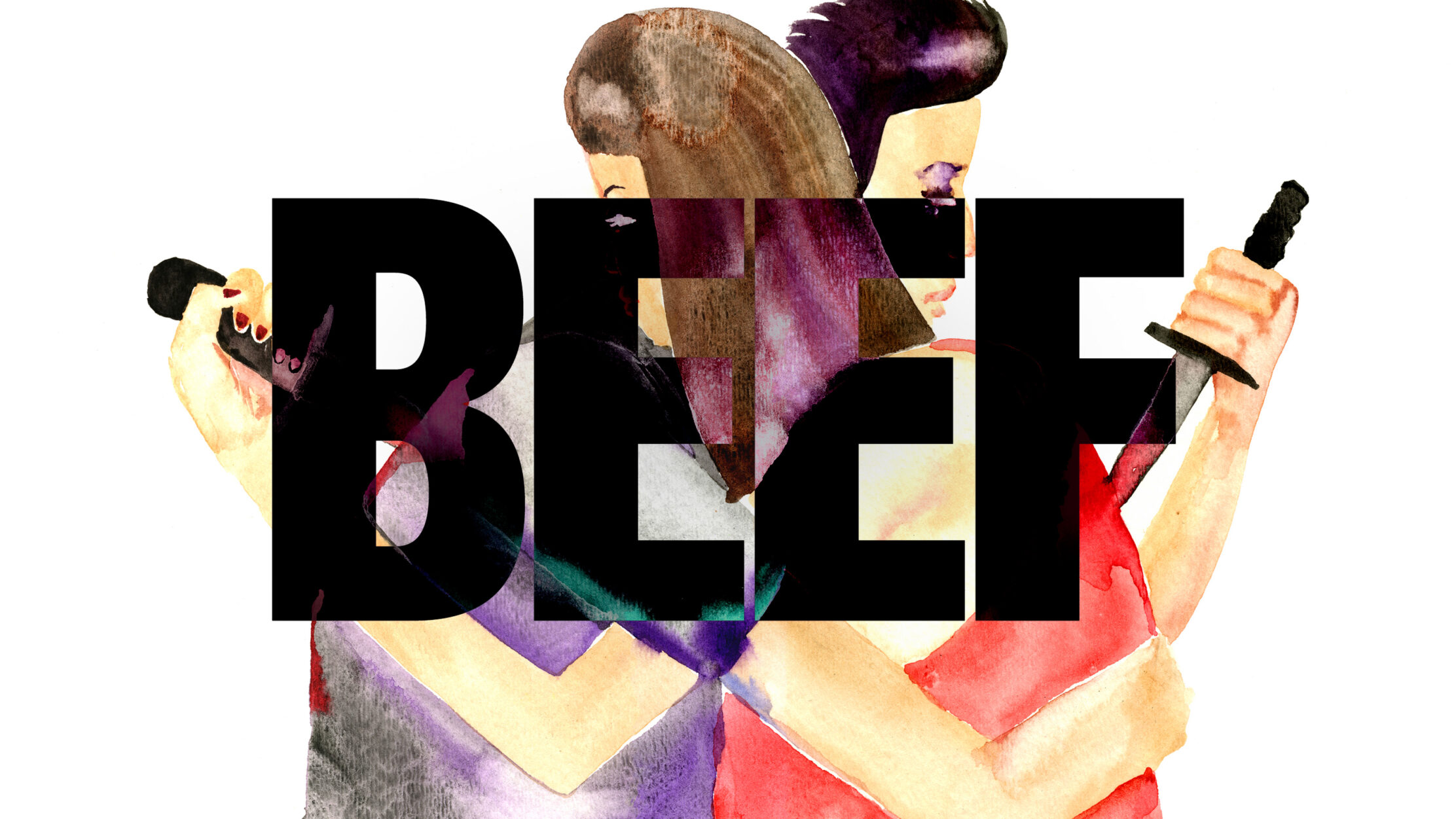
Each title design is a painting representing the mood of the episode, accompanied by a quote and the name BEEF. As the Sarofsky team specifies, this design was “heavily inspired by 90’s album covers and magazines such as Ray Gun”.
For the logotype, the team wanted to go with a choice that gushes out strength, robustness and of course, beef. That’s why they chose the classic sans serif & clean grotesque typeface, Balboa but with some tweaks designed also by the Sarofsky team. For the episode titles, they preferred a less condensed sans serif, the Degular, to allow paintings to shine without stealing focus from them.
Guardians of the Galaxy: You say superhero movie, we say superhero design
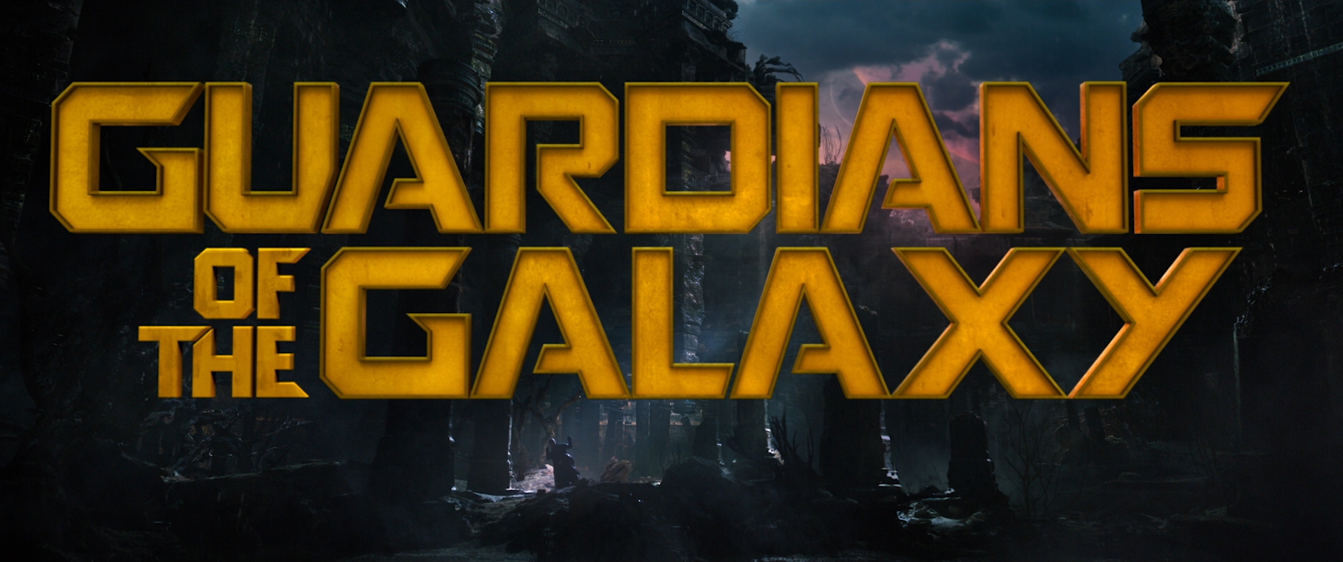
“The title sequence is not some cheap button that we put on a film. For us, it’s like the jewel in the crown, the treasure. Sarofsky has been an essential partner in making it that”, said Victoria Alonso, Marvel Studios’ Executive Producer and you can already understand that working for a Marvel superhero movie, as popular as the Guardians of the Galaxy is literally no joke.
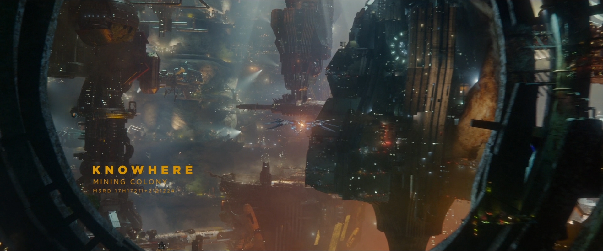
According to Sarofksy, working on Guardians of the Galaxy Volumes I & II was a special experience, as writer/director James Gunn was very involved in the process and had a very specific vision, making it a great collab among creatives.
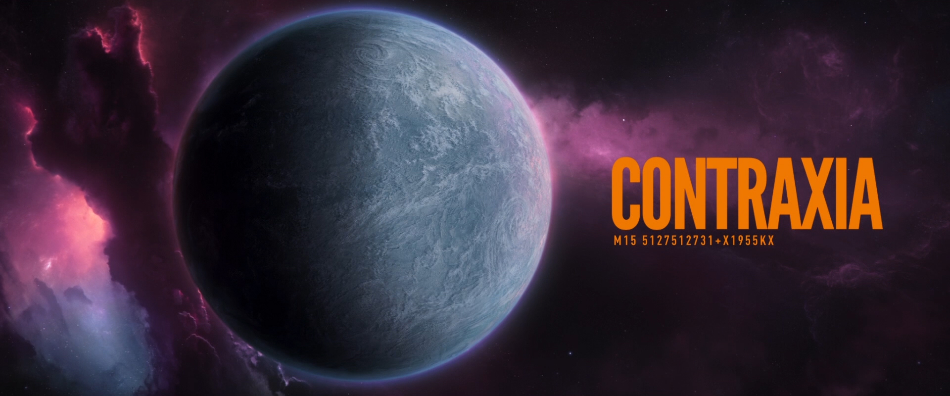
For the main title, the designers came up with a custom glowing gold typeface that is by now a “classic” for the real fans of superhero movies. The typeface, its movement, placement, texture, timing and form is completely aligned and designed to work 100% in harmony with the opening sequence of each film.
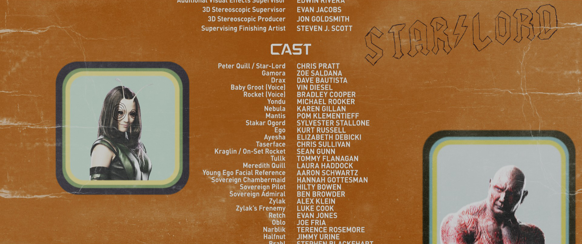
And we’re not done yet. Sarofsky got to have some extra fun, designing the end crawl. In order to keep the audience focused through an array of hundreds of names they decided to go with a more relaxed, whitty approach, inspired by the ‘70s and some colorful album covers.
Platonic: A visual metaphor of a chaotic relationship
Platonic is a new series, released in May 2023 by Apple TV+, created by Nick Stoller and Francesca Delbanco, starring Rose Byrne and Seth Rogen. It is a limited series about two old friends, a man and a woman, that meet again after their break-ups and try to reconnect as adults, leading to a lot of chaotic happenings.
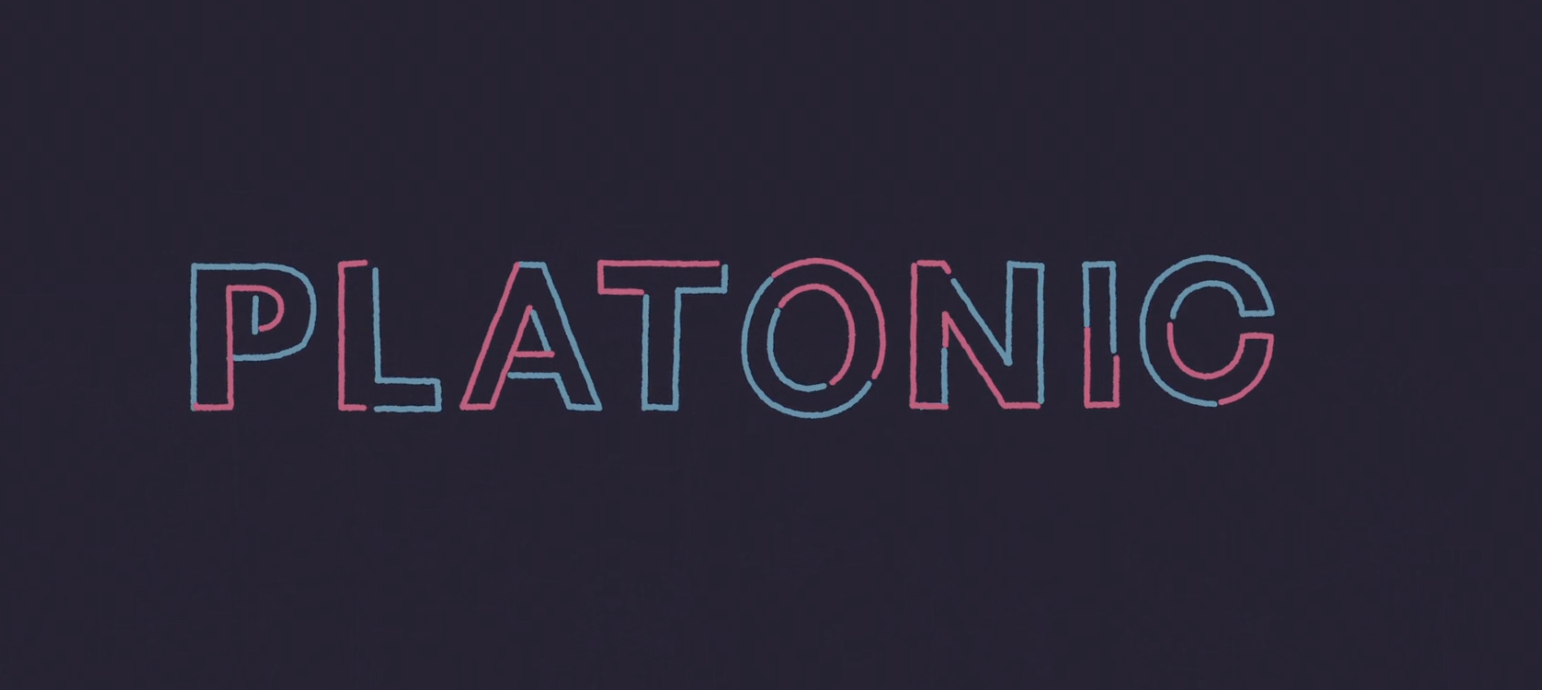
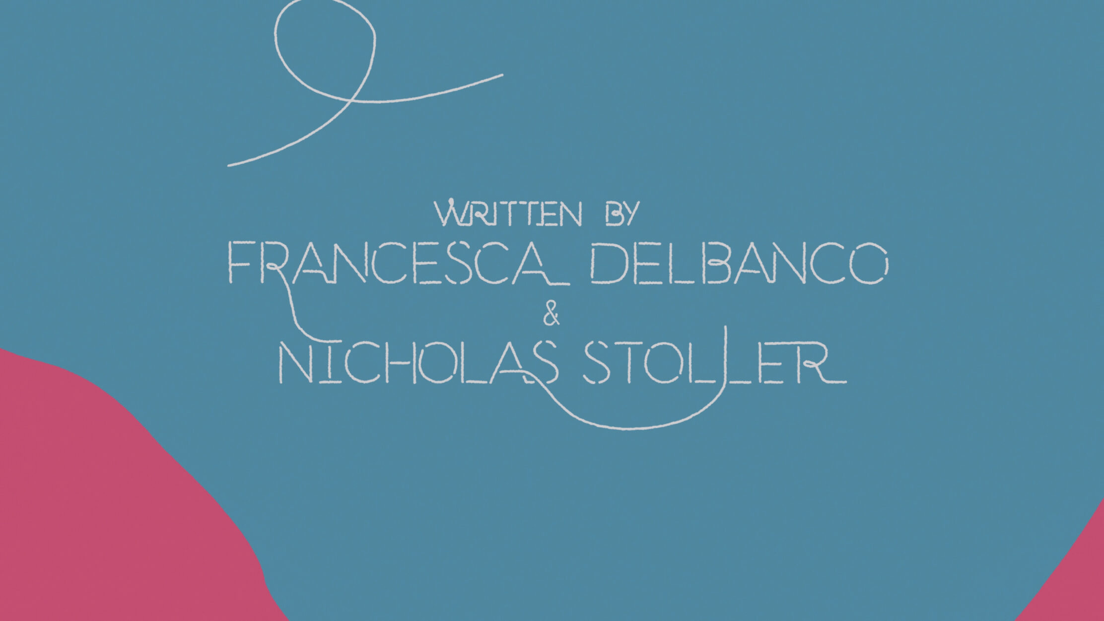
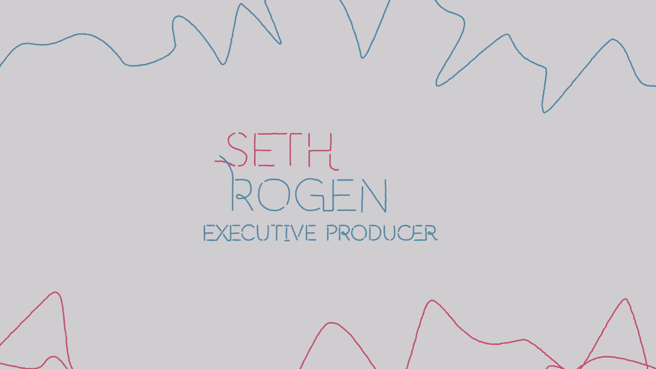
To capture the essence of this complex relationship, Sarofsky created a visual of two lines (one pink, one blue) that flow, intertwine, clash, unite and create beautiful lettering to present the series and the people involved behind it. The handwriting typeface is custom made by the design studio, created as an organic outcome of the linework that is constantly running through the opening titles. As they say themselves, “It’s rare to have the cast and crew credits to be so integrated into the key visuals within a main title and we are so excited that it all lives as one visual language”.
Obsessed with title design!
Are you? We are. Check all of Sarofsky’s work here & start watching more films, paying attention to the title designs and the creators behind them!
Tags/ graphic design, series, movies, analog typography, cinema, netflix, title design, motion design, movie title
.gif)
.jpg)
.jpg)

.jpg)
.jpg)
