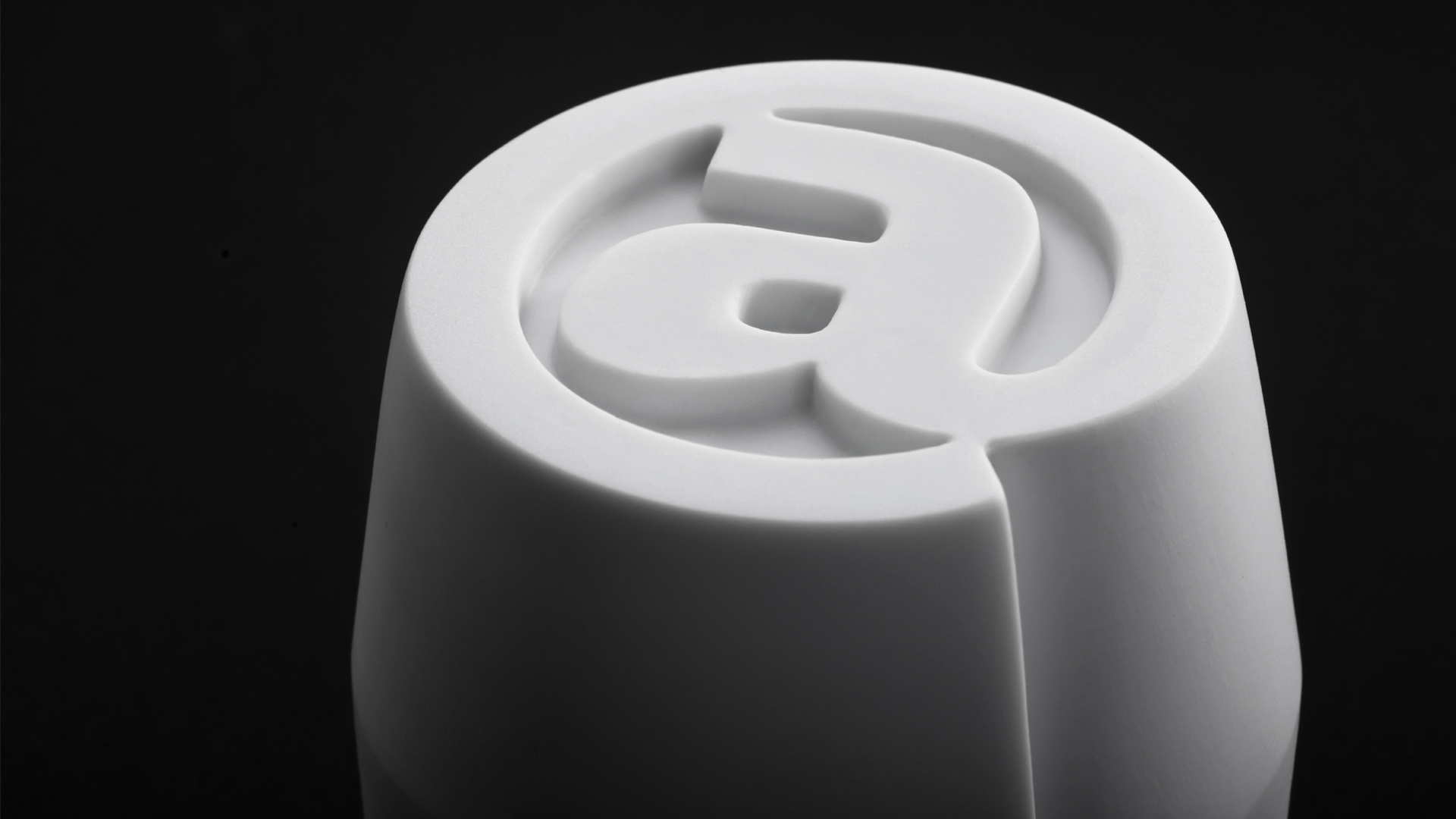
The latest hot new rebrands: Nickelodeon, Glassdoor, Netflix’s Most & the new Twitter
It’s the middle of the summer season but the branding and design world is still moving fast and forward. Nickelodeon brings back the splat logo - revamped and 3D, Glassdoor gets a major glow-up and Netflix sub-brand, Most, comes out renewed, with a vivid blast and Elon Musk kills the blue bird Twitter logo for an X.
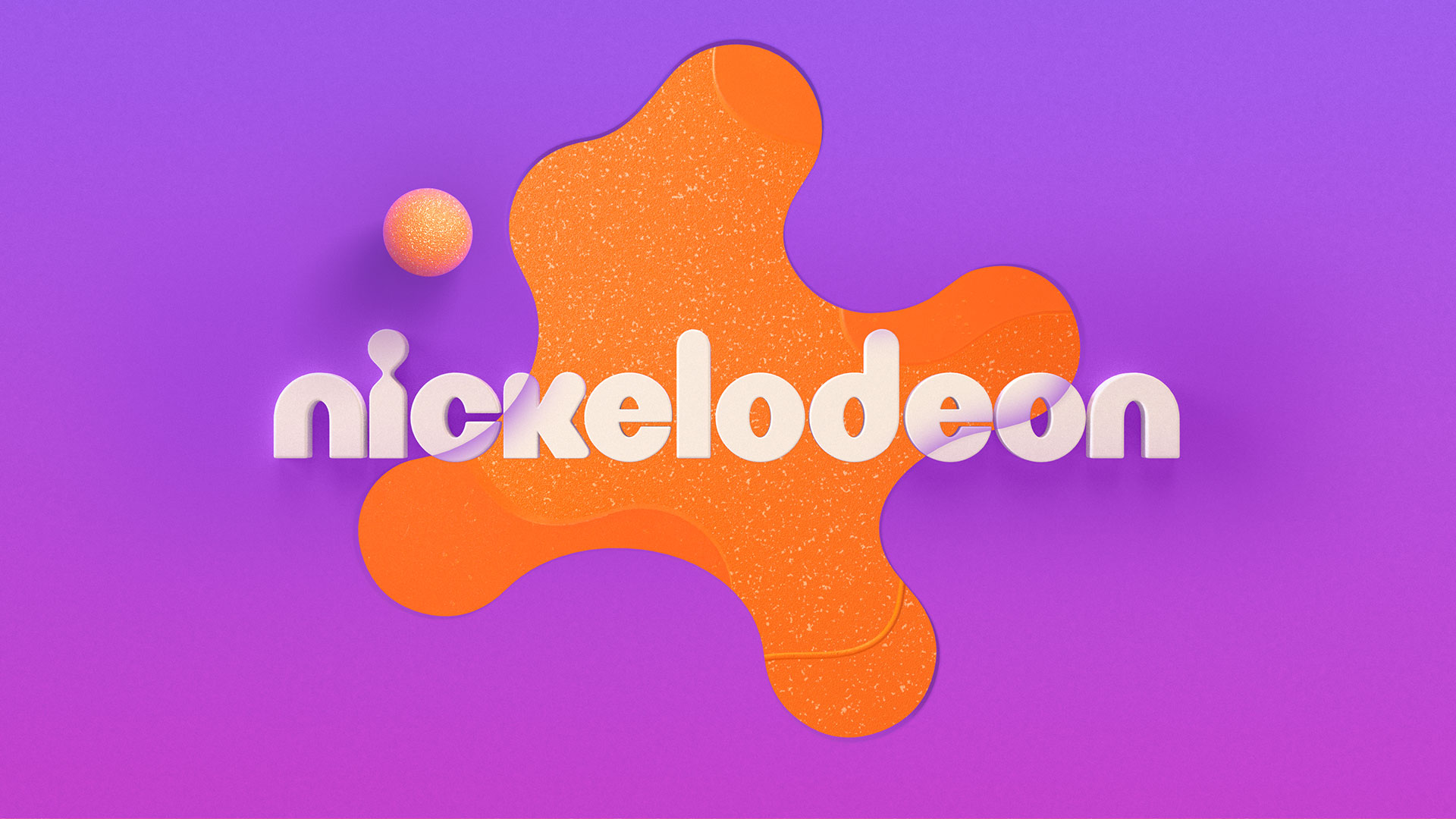
Nickelodeon: A rebrand full of colours, joy, fan and exquisite graphic design
Nickelodeon Global Rebrand - 2023 from Roger.tv on Vimeo.
The Nickelodeon brand is inextricably connected with the image of the splat. The orange, fluid, fun splat. The splat logo first appeared in 1984, just 5 years after the channel was launched, when the company decided to rebrand and asked young designer Scott Nash and former professor, Tom Corey to take over. They came up with the idea of this logo that could take different dynamic shapes, a “flexi-logo” as they call it, in order to adapt in different applications, situations and evolve. In 2009 though, the splat disappeared, because the company considered it dated.
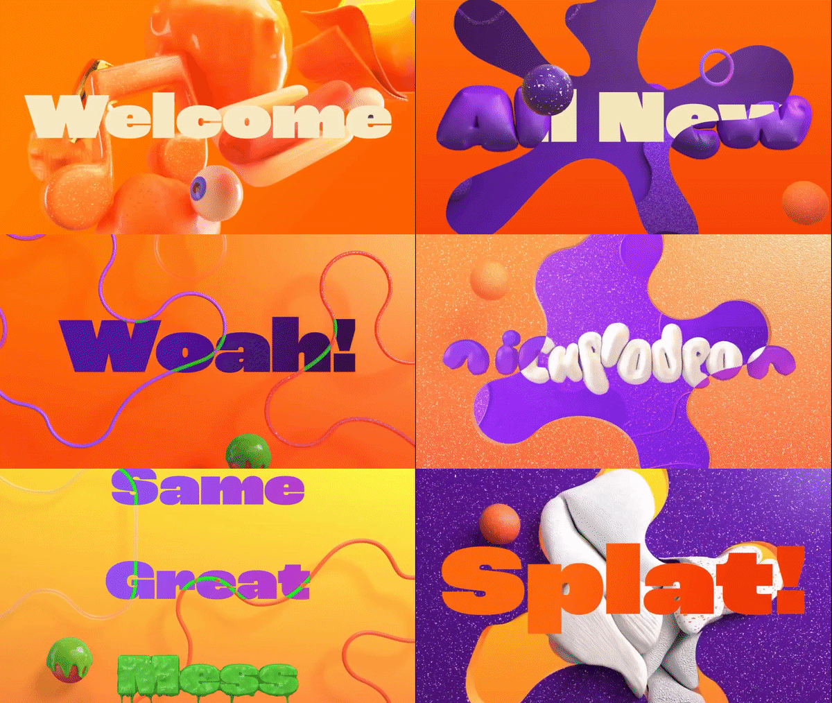
But after 14 years, in 2023, guess what? The splat is back! Nickelodeon revealed its new logo, featuring a fresh, modern, simplified version of the orange splat. But this time the splat is not just a logo. This dynamic, super fun morph has evolved to be kind of a visual, motion language for Nickelodeon. Design Studio Roger created a series of 3D animations using different 3D forms of the splat, paired with typography that is also blended and entering the 3rd dimension. For these videos, the designers chose the ROC Grotesk font alongside Neue Plak and they also pushed the rebrand even further by adding new colors like purple and lime green to the mix.
“We love a brief that asks us to tap into our weirdo kid brains. Kids are all about trying everything out, so we wanted to make a brand that allowed for revisionism, randomness, and irreverence. That said, the design language needed consistency across every touchpoint of the Nickelodeon brand, from on-air to digital and social media to the product packaging and resort experiences, so we knew we needed a very accessible core to the visual identity”, said Roger creative director Braden Wheeler.
Glassdoor: Looking for a job in absolute style
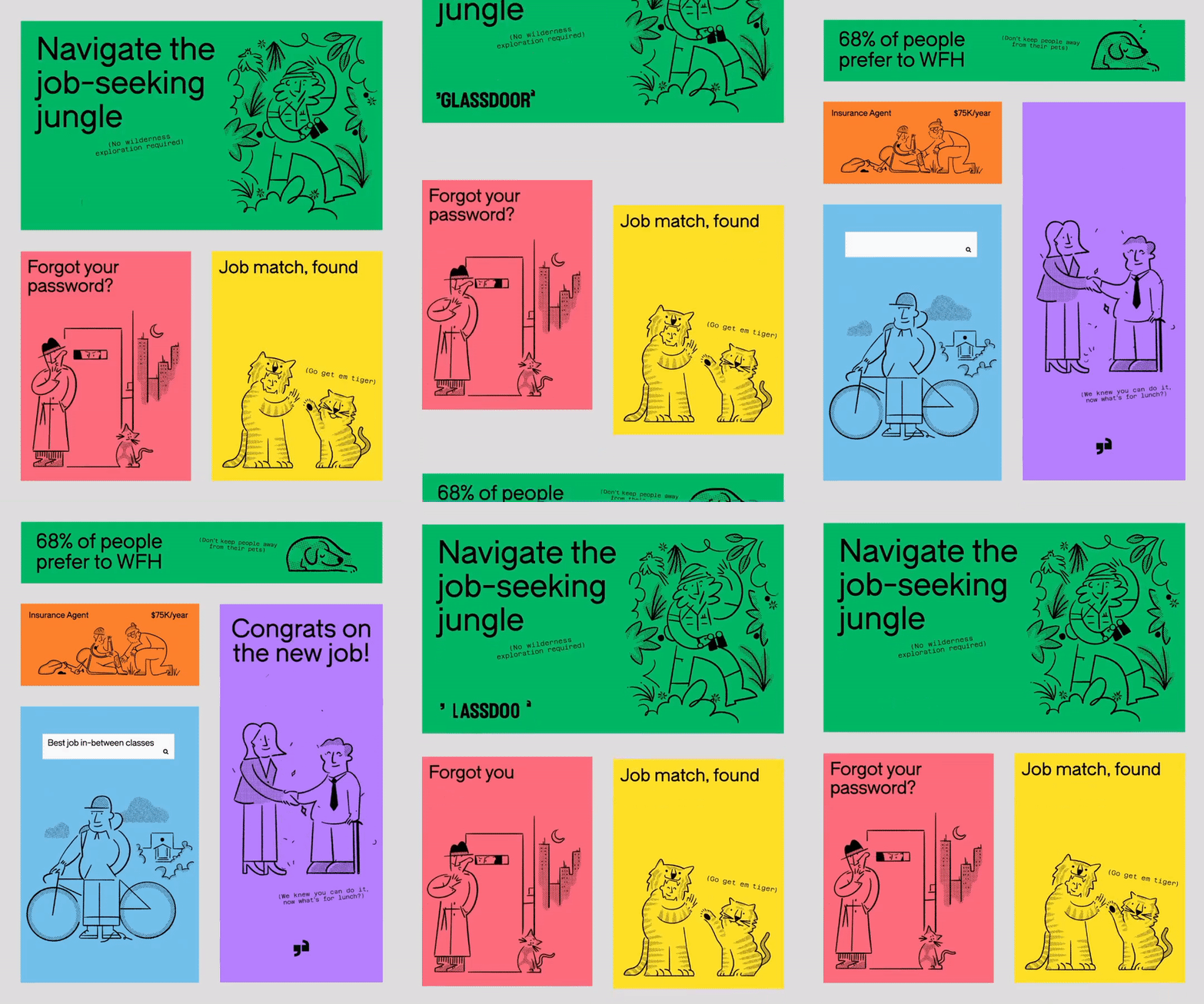
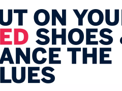
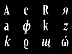
Glassdoor is celebrating its first rebranding, carried out by design studio Koto, based in London. This rebrand consists of a new motto “Where work talk gets real”, a new app & website, new color palette, illustrations, motion graphics and of course a custom typeface called Glassdoor Sans. For the creation of Glassdoor Sans, Koto worked with type designer Giulia Boggio and TYPE01 and together they delivered a fresh sans serif typeface for the project.
“Together, we built a holistic brand that exudes confidence and open-mindedness, amplifying users’ voices through transparent conversation. The new logo brings the positioning—Real work talk—to life: the name being the center of workplace conversations, with g/d-shaped quotations flanking the wordmark. The all-caps treatment of the type is a direct and fresh departure, standing tall and door-like, swinging open when animated”, said the Koto team.
Apart from the new logo and typeface, they also collaborated with artist Josep Puy, “to create a playfully sophisticated illustration library, bringing to life the key themes of conversation, diversity, anonymity, and collaboration in product and marketing”. Moreover, they expanded the color palette, by adding more secondary colors next to the brand’s characteristic green shade, in order to represent diversity and transparency in the company. Lastly, they designed a bunch of added features, emojis, symbols, motions, movements, scrolls and reveals to make navigation easy and playful too.
Most: A playful, joyful and vivid rebrand for the LGBTQIA+ storytelling platform
Most is Netlix’s sub-brand focused on LGBTQIA+ stories and representation, aiming to be a platform where queer people get to share experiences, opinions and joy. Studio Nari was called upon to work on a new identity that could “truly represent Most’s diverse community and capture the attention of both Gen Z and Millennial audiences”.
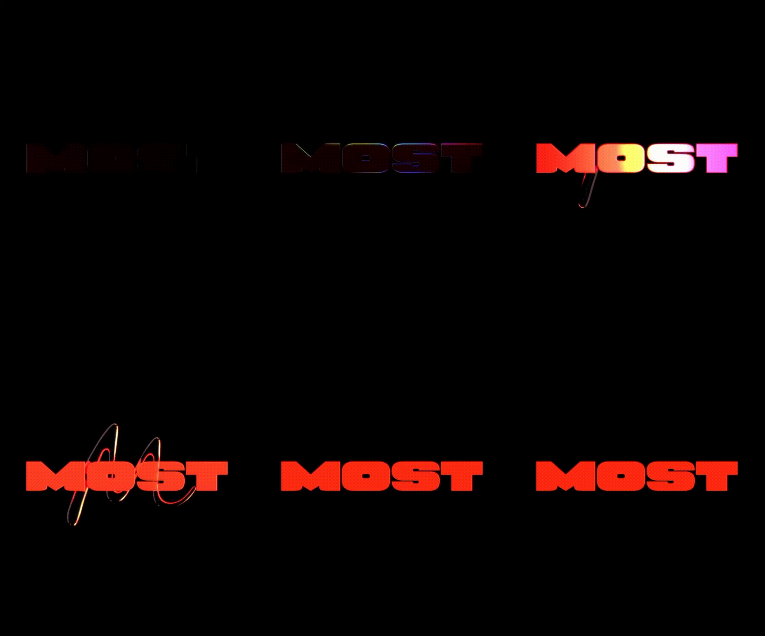
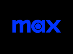
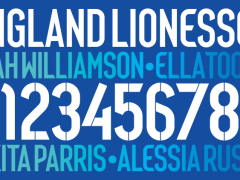
Starting from the logo, Studio Nari was based on Netflix’s original aesthetic and design approach to create an eye-catching watermark. To do so they designed a bespoke typeface - based on Netflix Sans - called Netflix Sans Most that is used in all Most’s applications. The typeface is quite similar with Netflix Sans but it has some added flair, heavier weights and larger forms.
One of the most exciting elements of the rebrand though is a set of bespoke emojis and a full motion language designed for Most by Studio Nari. Lollipops, hearts, inflated stars and high heels in bright colors - including a custom made rainbow gradient, add a really playful, joyful, contemporary and of course bold and queer character to the whole new visual identity.
Twitter: R.I.P. little blue bird, welcome X
— Elon Musk (@elonmusk) July 23, 2023
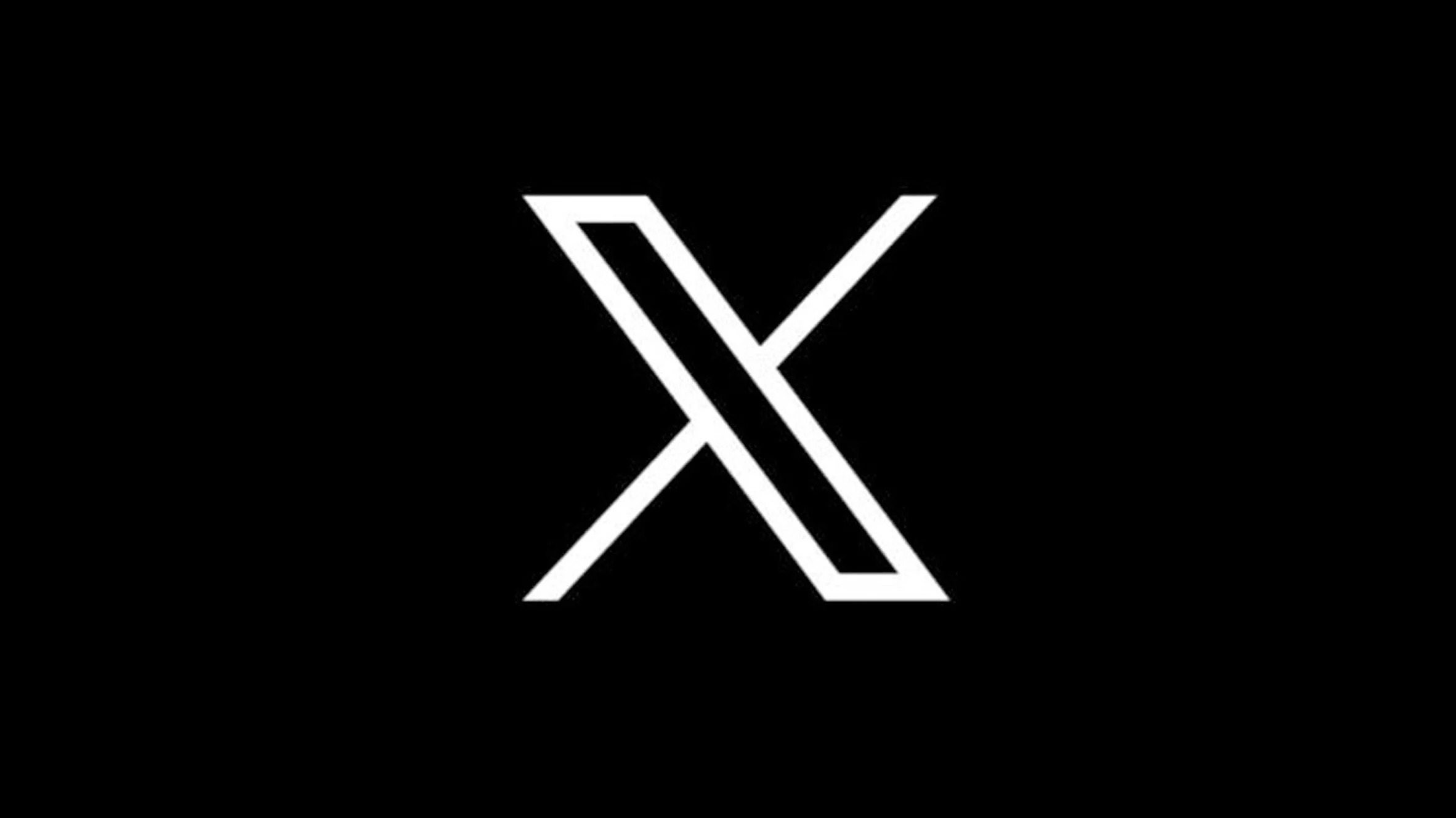
Elon Musk is once again finding himself in the center of attention. This time he decided that enough is enough with this little blue bird logo, asked his audience to propose to him new logos based on the letter X and stated that “soon we shall bid adieu to the Twitter brand and, gradually, all the birds”.
The new logo was posted by Sawyer Merritt, co-founder of the sustainable clothing brand Twin Birch. He clarified that this logo was made for a discontinued podcast that he had, talking about Elon Musk’s ventures, by designer Alex Tourville. The design is based on the unicode font Blackboard bold, raising copyrighting issues as it could be used by anyone. However, Elon Musk announced that this is not the final form of the logo and that it could be replaced or maybe just refined.
Tags/ logo, rebranding, logo design, social media, animated typography, rebrand

.gif)
.jpg)
.jpg)
.jpg)
.jpg)
