The superpower of Comic Sans is revealed in Dyslexia Scotland’s campaign for design inclusivity
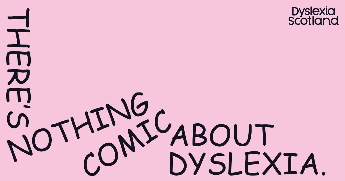
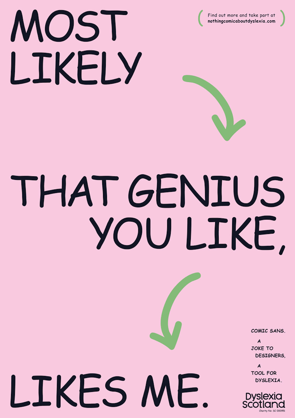
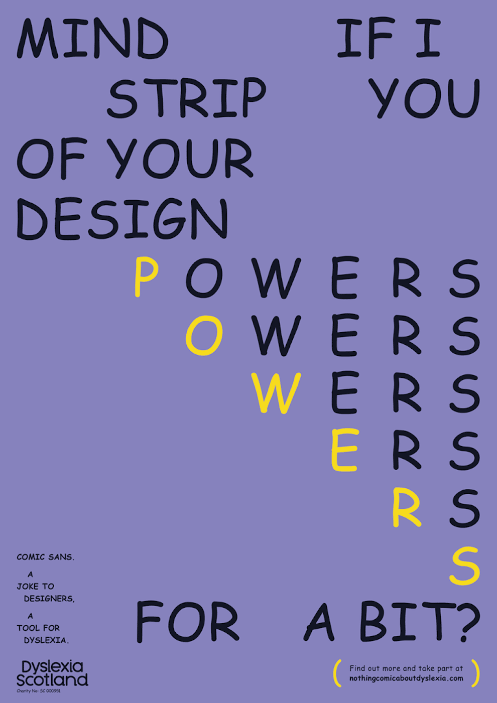
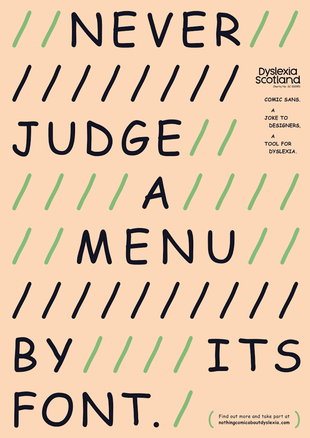
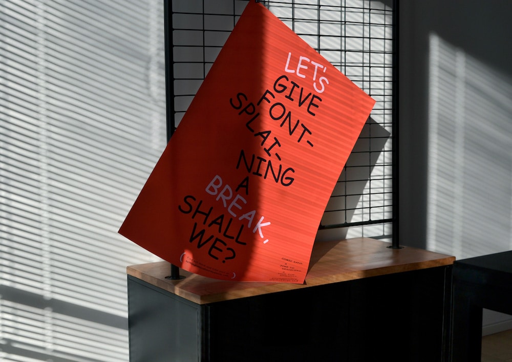
“Hey, it’s me Comic Sans. Here to challenge all designers to make the design world more inclusive.” An honest greeting and a super smart campaign that aims to raise awareness of dyslexia, design, and the font that design professionals usually hate. Therefore, on the occasion of Dyslexia Awareness Month, Dyslexia Scotland launched a campaign around a font that is every designer’s nightmare aka Comic Sans.
A controversial type design since forever, Comic Sans is well known for its weird aesthetics. “The reasons for hating Comic Sans are known and widespread, they’ve been repeated endless times over decades. And although they might be valid, Comic Sans has an undeniable strength: helping 780 million people around the world with dyslexia read better” explains Dyslexia Scotland in its manifesto for Nothing Comic About Dyslexia, a campaign and a website that provides insights to type designers, urging the creative community to come up with more fonts that make reading legible and easier for people who suffer from the learning disorder that involves difficulty reading due to problems identifying speech sounds and learning how they relate to letters and words (decoding).
The campaign calls for a new approach and asks designers to “turn that irritation into inspiration to create dyslexia-friendly typefaces that they do not find comic. There’s Nothing Comic About Dyslexia is not a one-off solution. It’s an invitation to every designer out there to create fonts that help make design more inclusive. And a reminder that all prejudice really does is obstruct growth.”
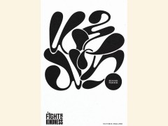
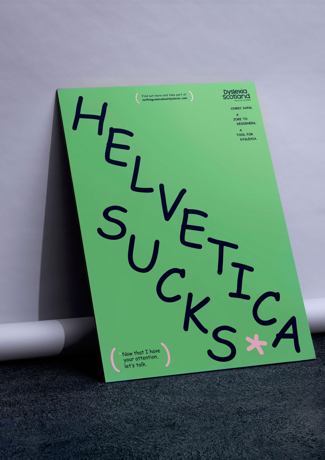
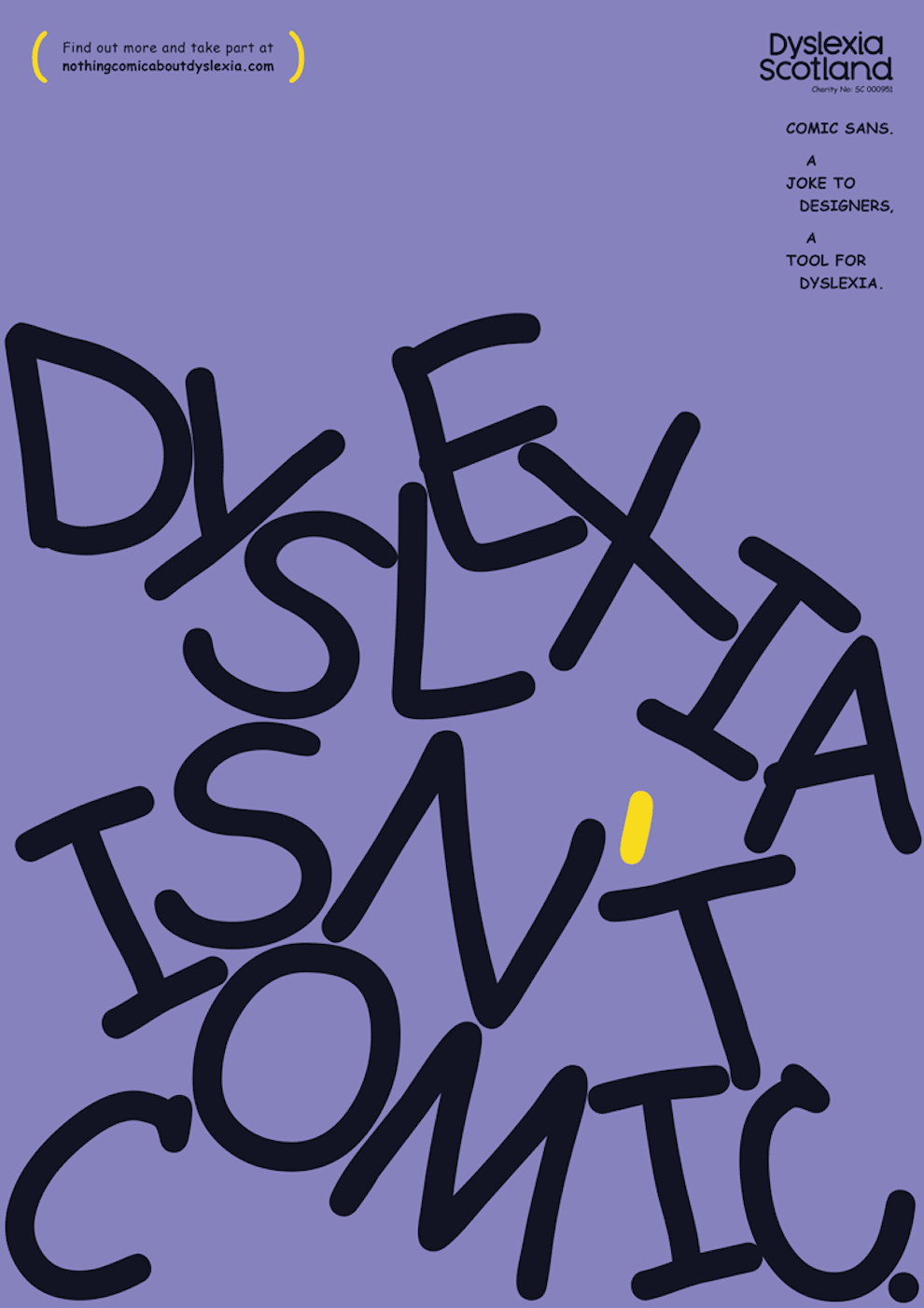
Aiming to inspire, the type-heavy campaign is typeset obviously in Comic Sans and has a noble task, it wants to “influence change in Scotland and around the world by activating influential changemakers to be dyslexia-inclusive.”
“People with dyslexia can be excluded by some formats of written information; and designers are key to creating more accessible styles of text” notes Katie Carmichael, Lead for Creative and Digital, Dyslexia Scotland.“Our campaign ‘There’s Nothing Comic About Dyslexia’ aims to do just that, by giving designers the opportunity to be bold trailblazers on the journey to a more dyslexia-friendly mindset. It’s fairly easy, all it takes is their willingness to create change through what they admire most: beautiful design.” To achieve the best possible outcome, Dyslexia Scotland collaborated with Innocean Berlin and WeTransfer.
Everything you type should be in Comic Sans font today and this is why
View this post on Instagram
“When I was approached by Innocean Berlin and Dyslexia Scotland to partner up on a campaign using Comic Sans, I was initially hoping they were joking” explains Daniel Brokstad, the Norwegian multi-awarded graphic designer and illustrator based in New York who led the design and the creative direction of the campaign.
“However, as we talked through it I saw the potential in the concept. To attempt to create something presentable using Comic Sans alone might rub you the wrong way as a designer, but I saw it as an interesting design challenge that also has a good cause. Designing with Dyslexia in mind makes you change the outlook of how you’d usually approach the task, and I hope this campaign can open the eyes of others as well to consider an audience that is sadly often excluded.”
With WeTransfer, the internet-based computer file transfer service company that streamlines the workflow process for more than 87 million creative professionals in 190 countries as its media partner, Dyslexia Scotland has a great ally by its side.
“As a certified B Corporation, WeTransfer integrates environmental and social values into every corner of the business and product” notes Lina Ruiz, WeTransfer’s Head of CSR. “Our ambition is to educate our community about the need for accessibility in the online realm and encourage more inclusivity in innovation. By partnering with Dyslexia Scotland and Innocean Berlin, we are calling on designers to rethink the way they approach traditional design principles and create new typefaces that are not only beautiful but also dyslexia-friendly.”
Embrace the campaign here and read the comprehensive Font Guide here.
Tags/ typography, typeface, campaign, dyslexia, typedesign, wetransfer, dyslexia scotland, innocean berlin, daniel brokstad
