Inclusive by Design: How PF Optik Solves Modern Legibility Challenges
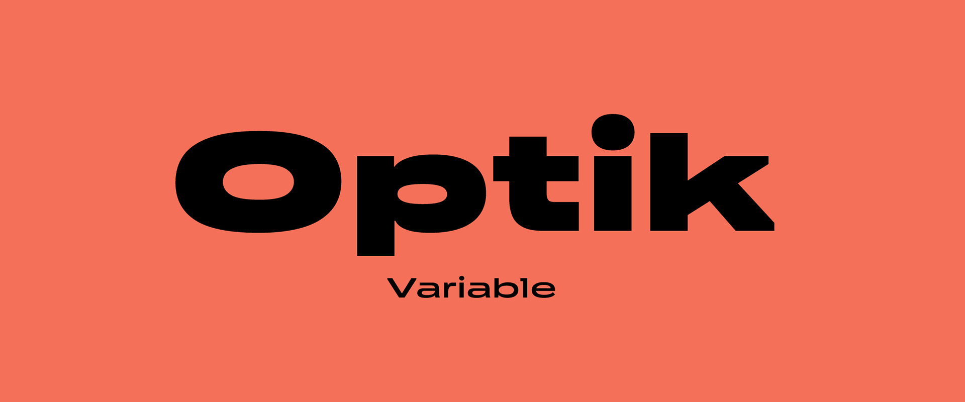
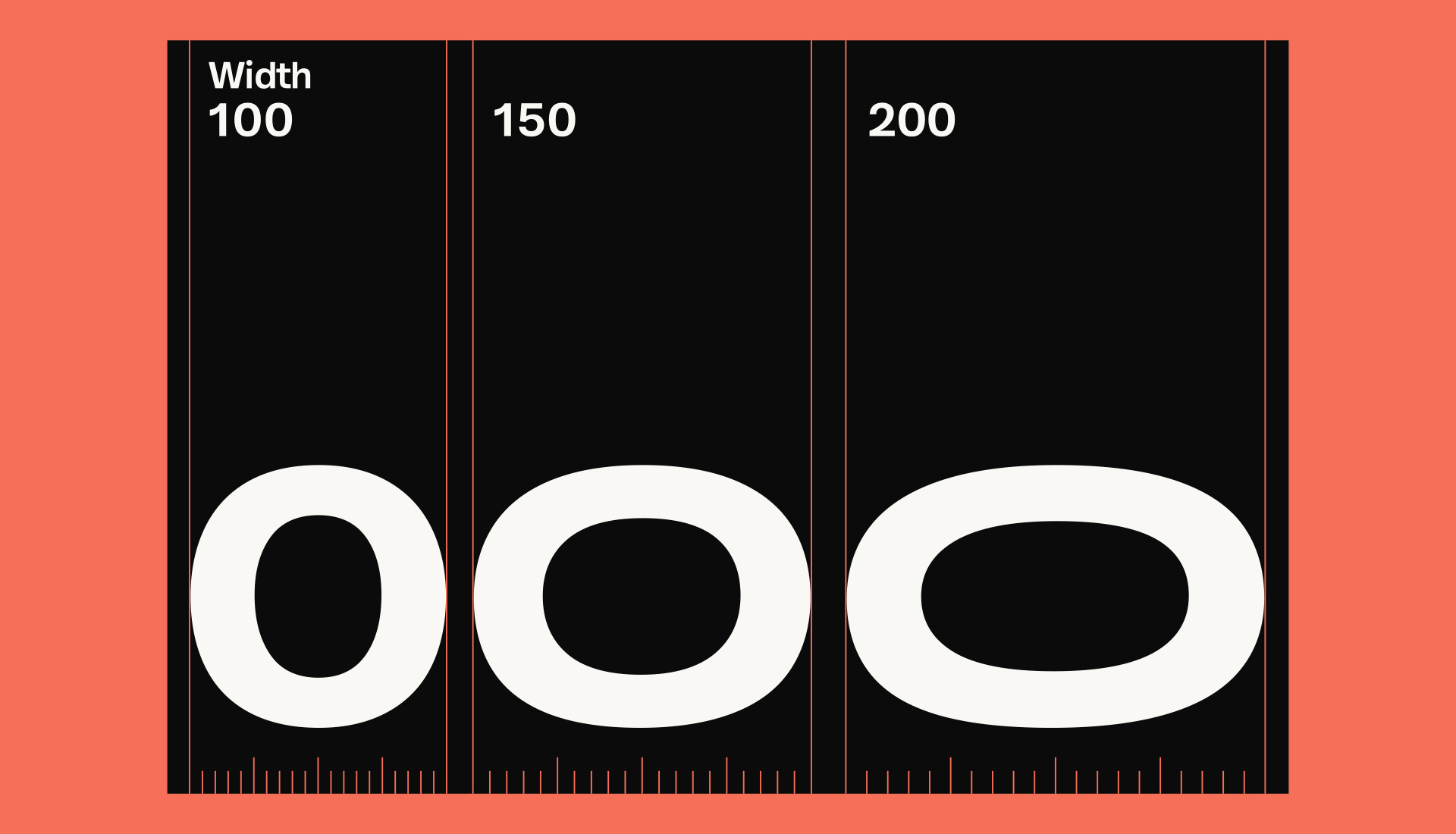
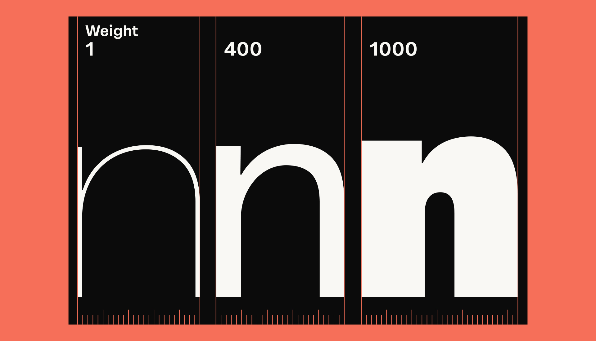
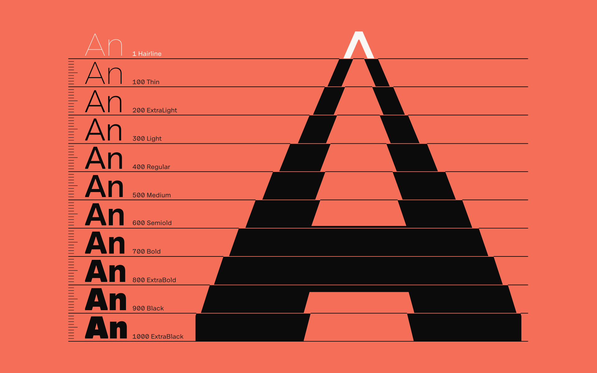
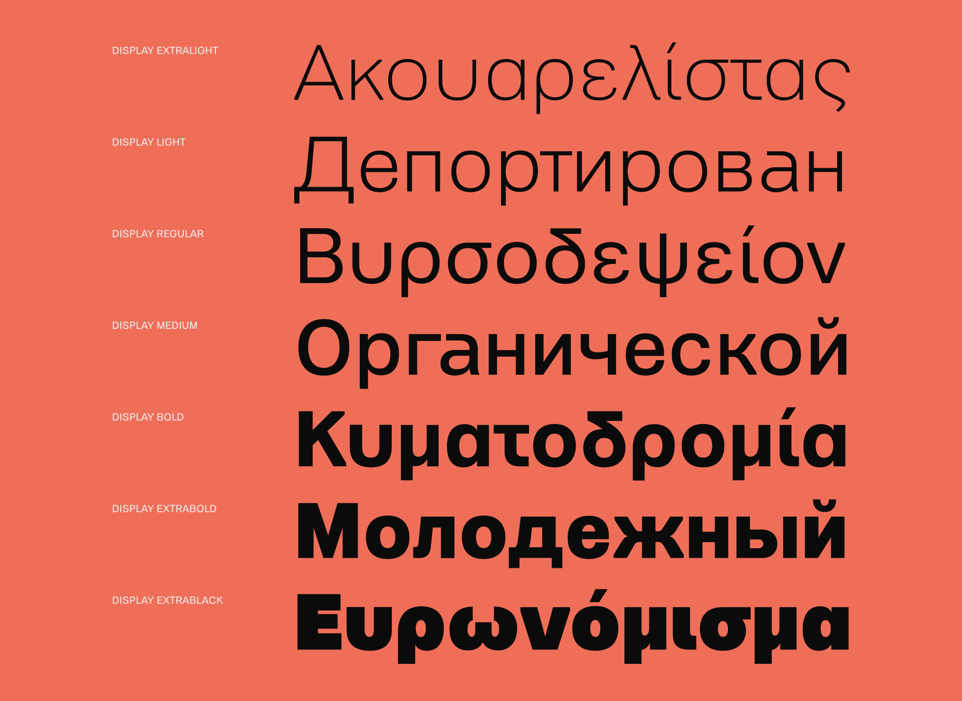
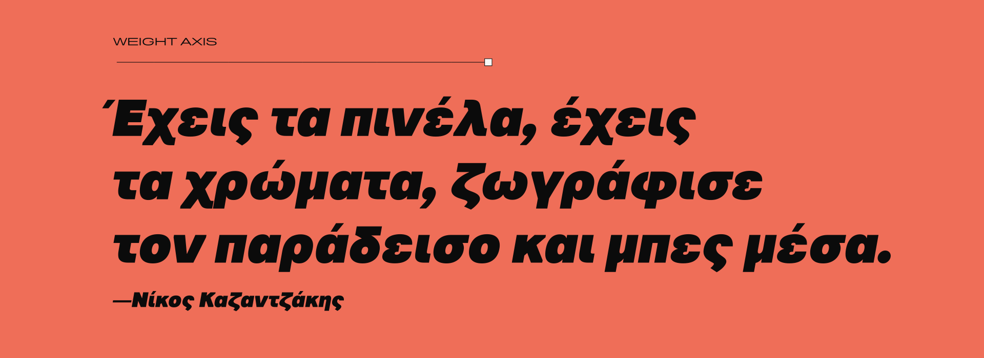
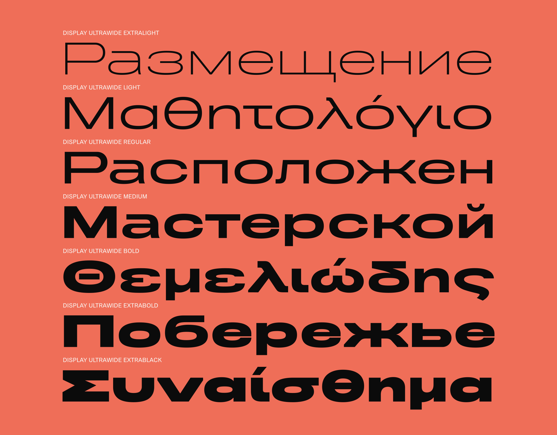
PF Optik is a multi-purpose, multi-script variable typeface with 3 axes such as weight, width and optical size, engineered to perform flawlessly across every environment — digital or analog, large-scale or small-print. Designed with a full range of optical corrections, it adapts seamlessly to the demands of modern typography while preserving clarity and balance at every size.
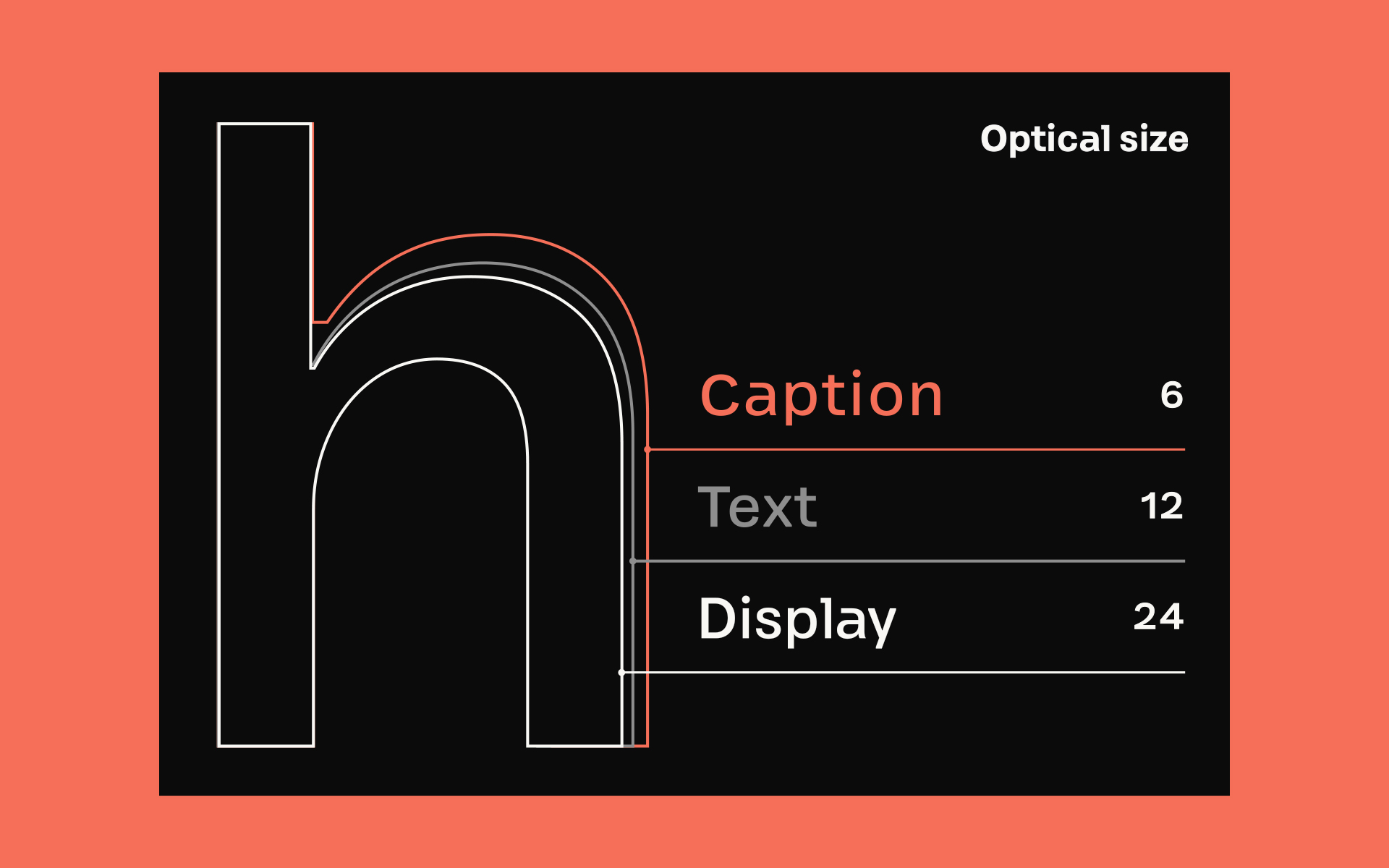
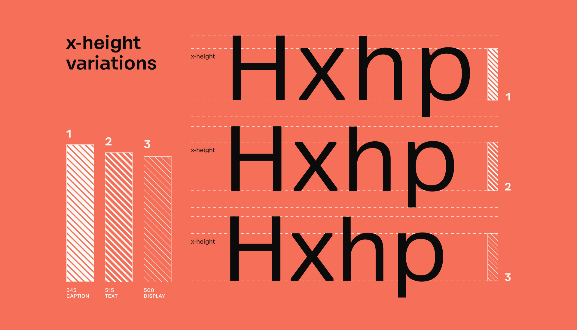
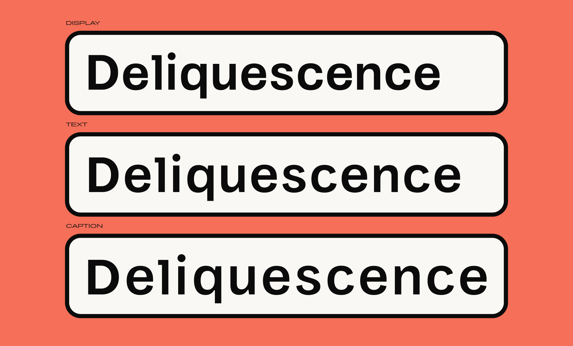
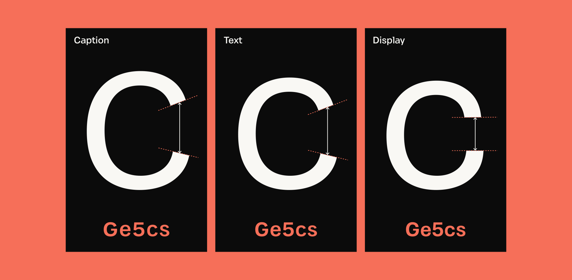
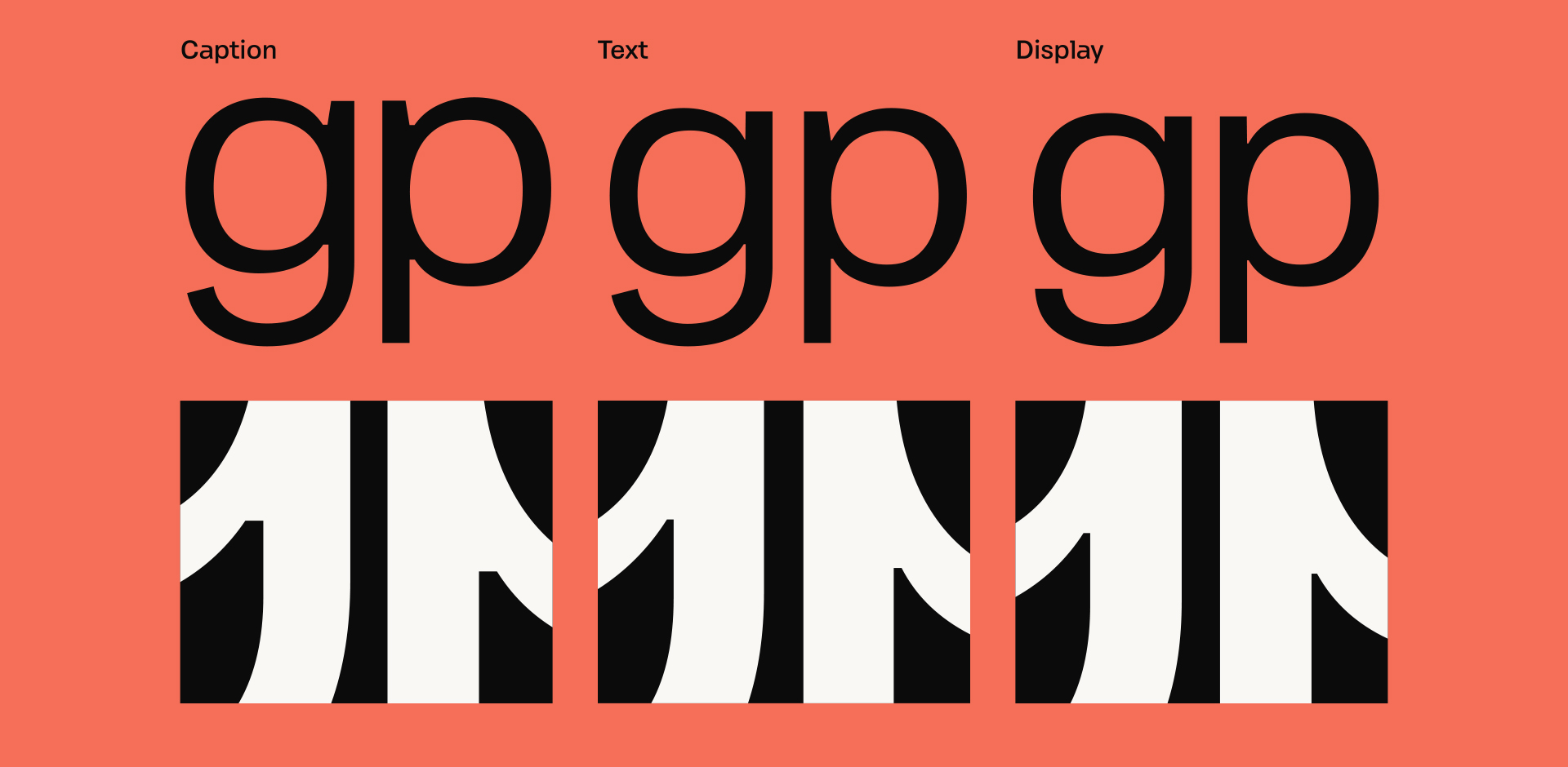
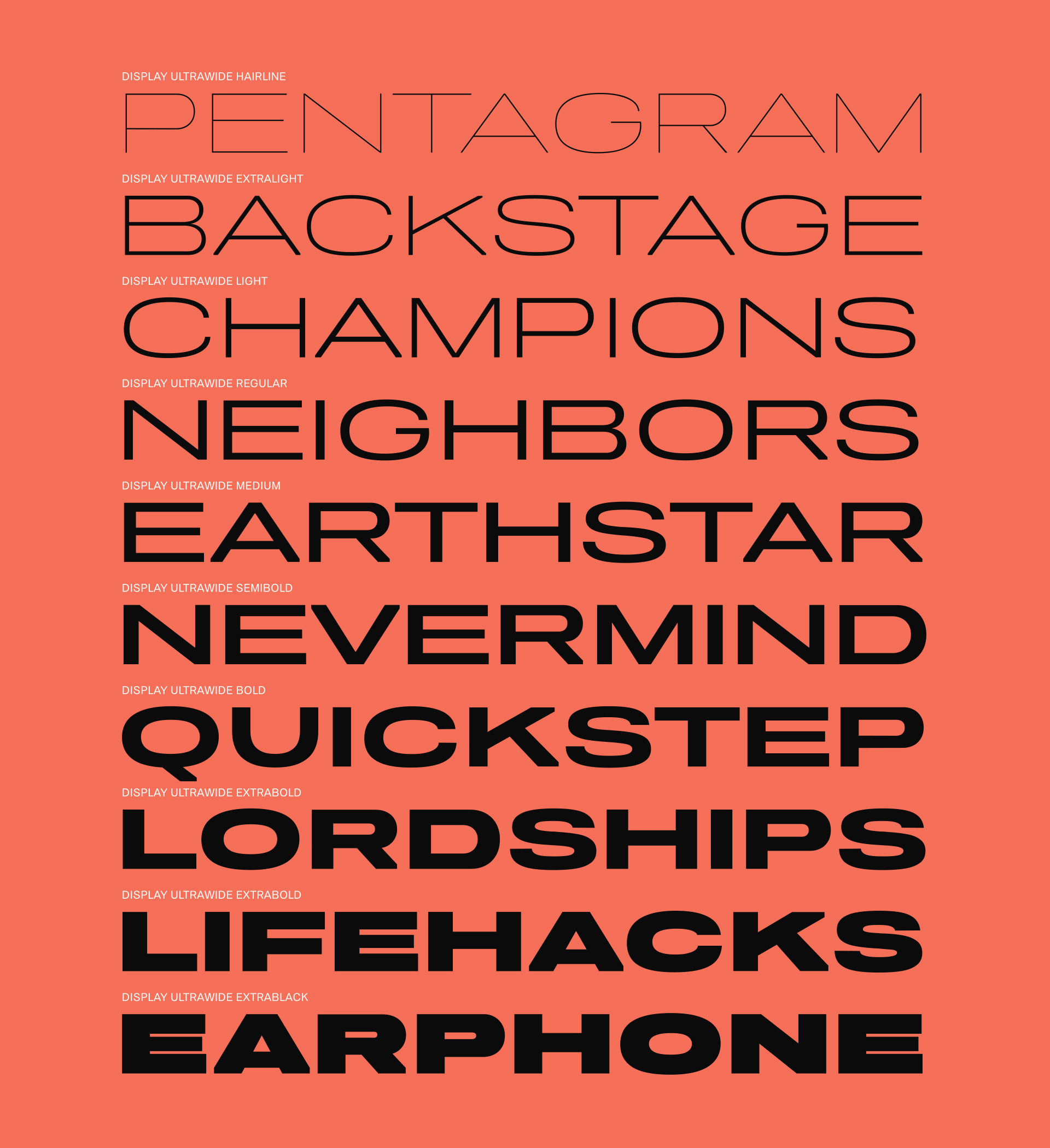
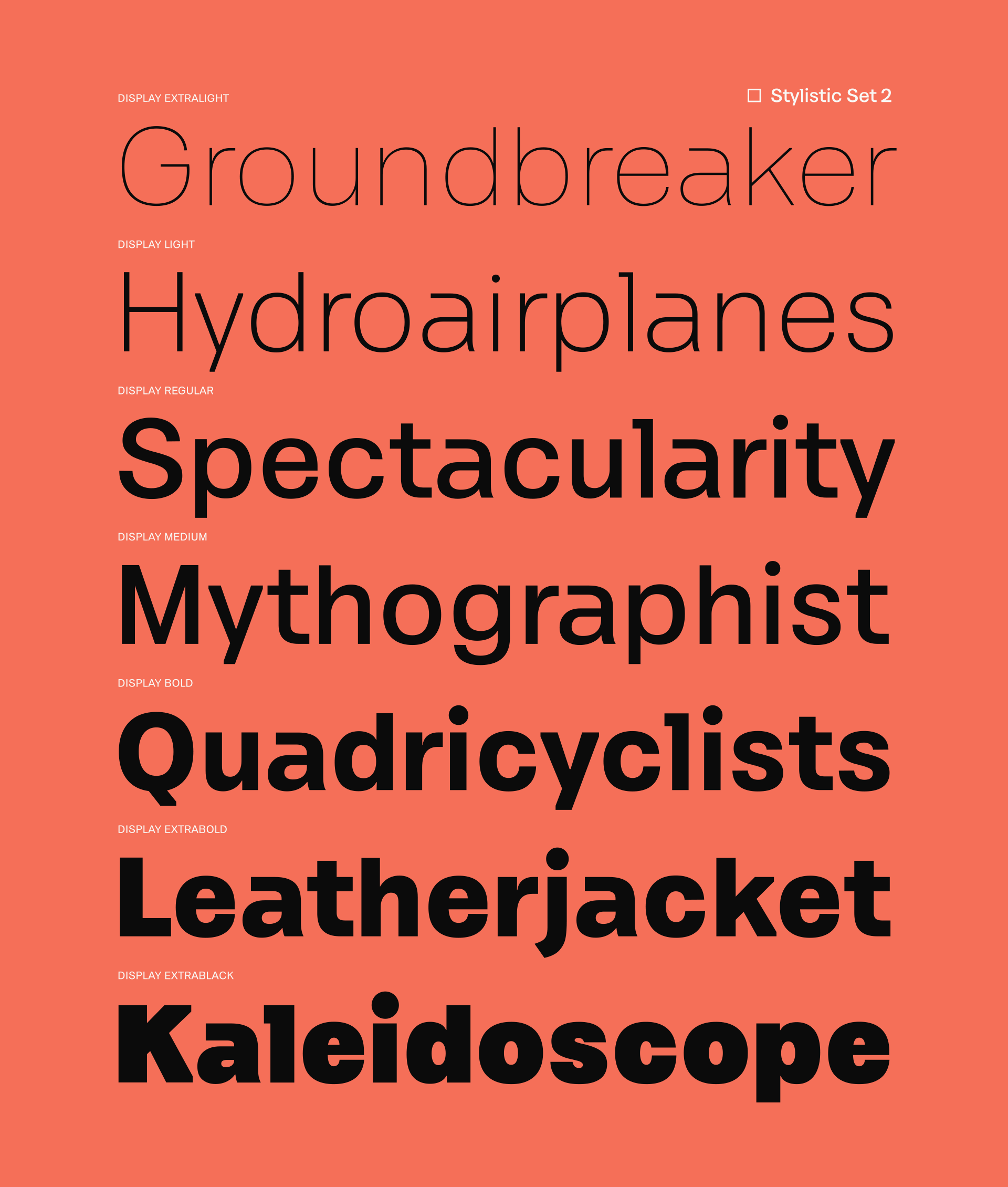
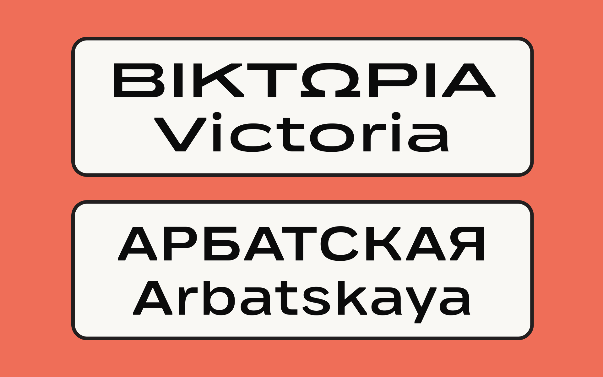
The family is structured into three optical subfamilies — Display, Text, and Caption, all packed under one variable font. Each is carefully tailored to its context: Display for striking presence, Text for comfortable reading, and Caption as a dedicated cut optimized for the tiniest sizes, such as book footnotes, magazine captions, packaging disclaimers, legal text, or mobile UI labels.
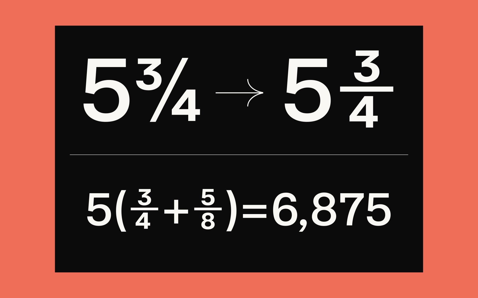
One of PF Optik’s defining features is its trimmed diagonal stems, which lend the typeface a robust, contemporary edge — though traditional sharp endings are also available as alternates. Across the optical sizes, glyph widths and x-heights increase progressively, expanding counters, clarifying strokes, and ensuring strong character differentiation. This creates not only greater recognition at small scales, but also a more balanced typographic color and visual harmony. Letter spacing has been fine-tuned to improve word identification, especially in dense or small text settings.
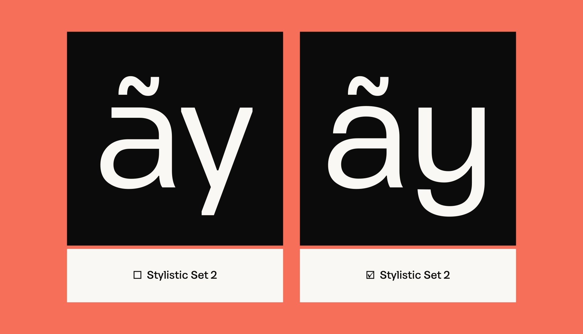
For print, PF Optik integrates enlarged inktraps at stroke intersections to minimize ink spread and preserve crisp edges under less-than-ideal conditions. Meanwhile, wide apertures and slanted terminals in the Text and Caption styles enhance accessibility, supporting low-vision readers with more open, legible forms. Angled spurs and deliberate differentiation of similar shapes add subtle rhythm while preventing confusion between characters — all features tested through simulated visual impairments to ensure true usability.
Altogether, PF Optik is a highly versatile variable font family, comprising 120 static styles and full support for Latin, Greek, and Cyrillic scripts. It is a tool built not just for beauty, but for clarity, inclusivity, and typographic resilience — wherever text needs to perform.
Type Foundry: Parachute®
Designer: Panos Vassiliou
Published: 2026
Test it online and download pdf
Tags/ fonts, corporate typeface, contemporary typefaces, display font, legibility, variable typeface, adaptive, multiscript, optical size, caption, text font


.png)
 1.jpg)

_page-0009.jpg)