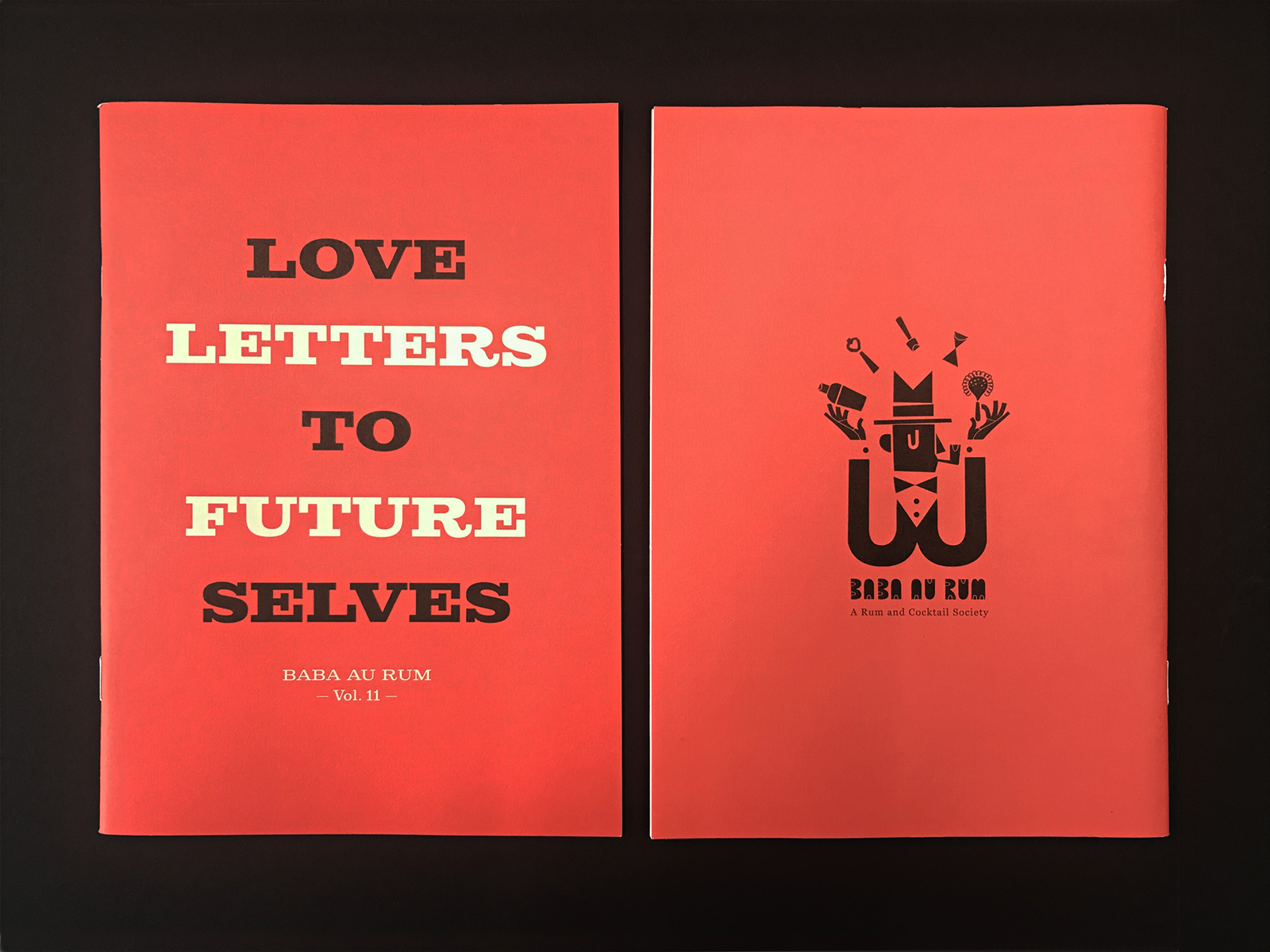
Baba Au Rum - An Ode to Typography
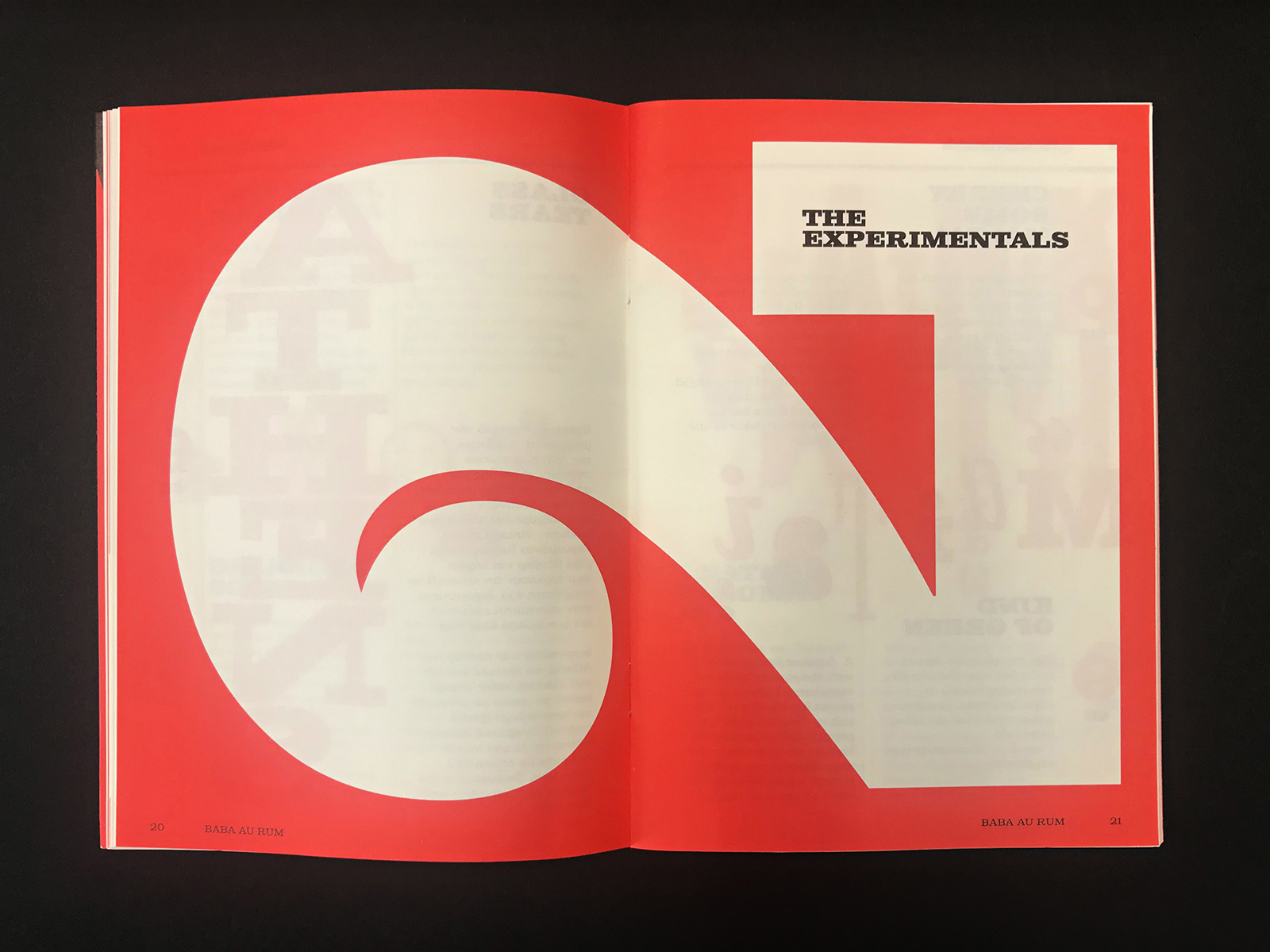
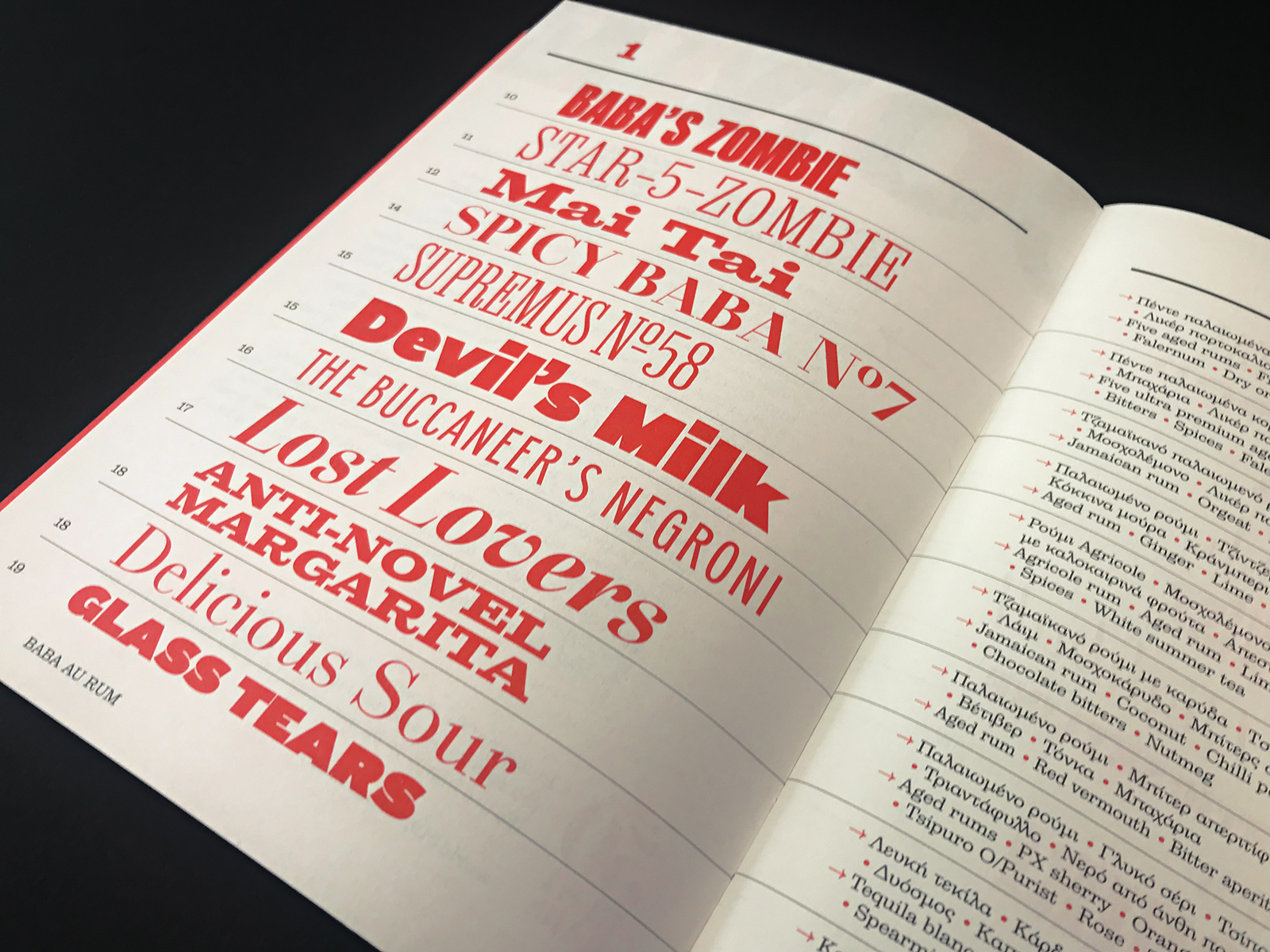
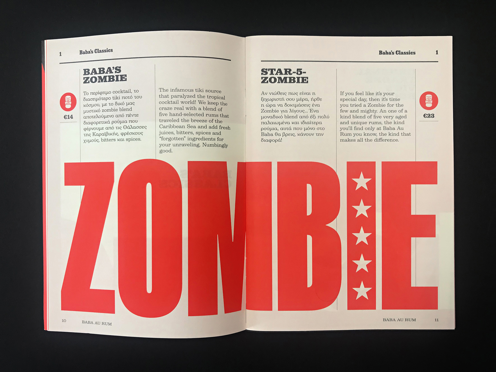
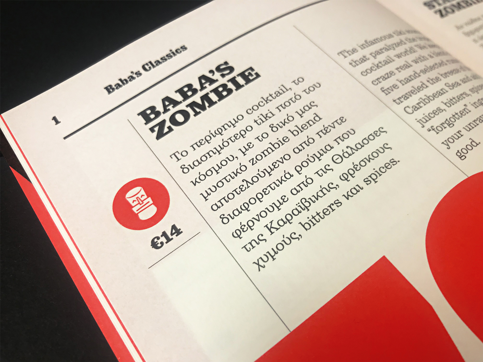
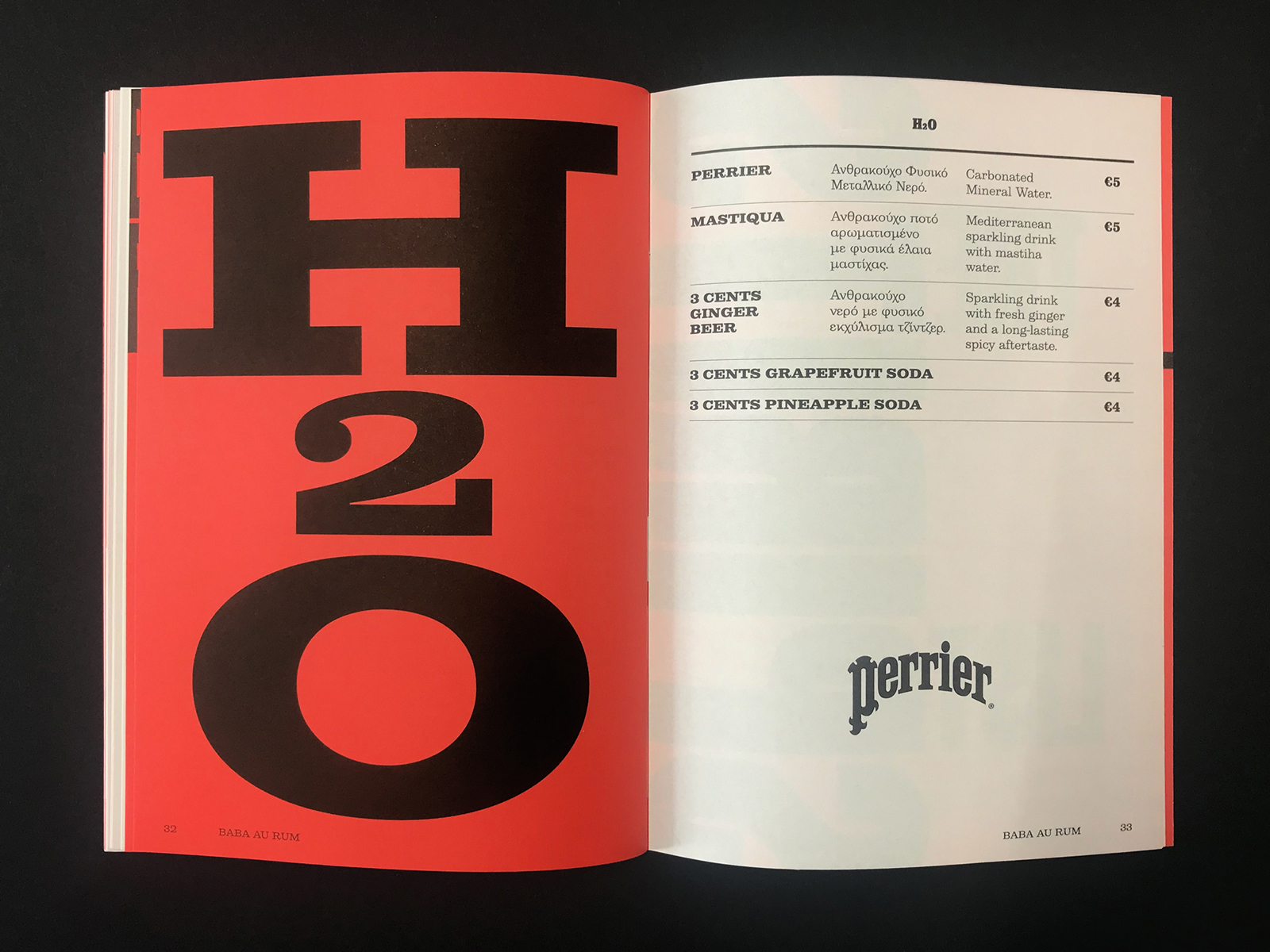
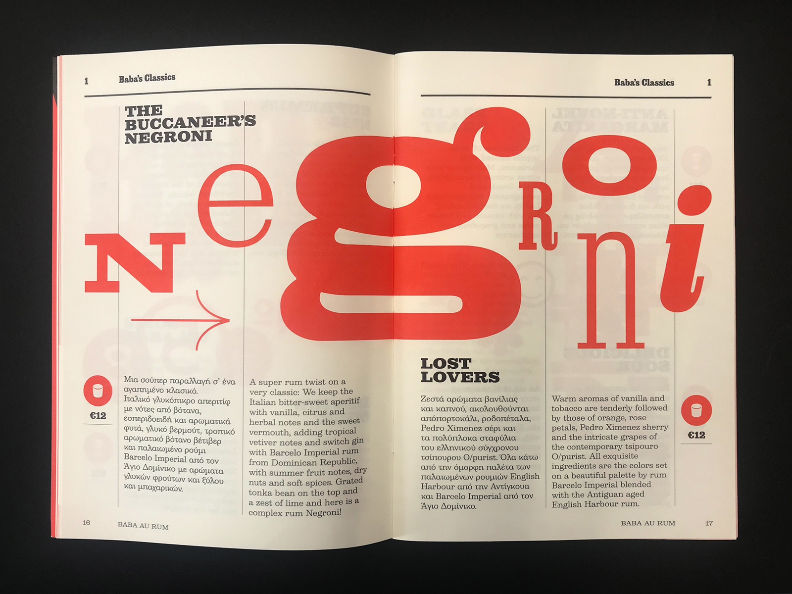
Named as one of the World’s 50 Best Bars, Baba Au Rum is a destination for exceptional cocktails, crafted with hand-selected spirits sourced from around the globe. For their catalog and cocktail menu, we designed a typographic system set in multiple Parachute® typefaces, carefully composed to echo the bar’s layered identity - bold yet refined, classic yet experimental. Each letterform was chosen to complement the character of the drinks themselves: distinctive, expressive, and built on craft. This project is an ode to trailblazing typography and fine spirits - two worlds driven by precision, experimentation, and personality. A celebration of design that doesn’t just communicate, but sets the mood.
Design: Parachute®
Art Director: Manos Daskalakis
Typefaces: Parachute® Type Library
Tags/ typefaces, printing, art direction, design and typography, menu design, bars

.png)
 1.jpg)

_page-0009.jpg)