All the Type Trends you need to stay fresh in 2024, revealed by Monotype
Every year, all aficionados of typography are waiting for Monotype, the leading authority in type and technology, to publish its Type Trends Report and predict what is ‘in’ for the new season. So, the 2024 Type Trends ,curated by Monotype's esteemed designers Jordan Bell and Damien Collot, is out and we took the time to delve into it and share with you a little sneak-peek overview.
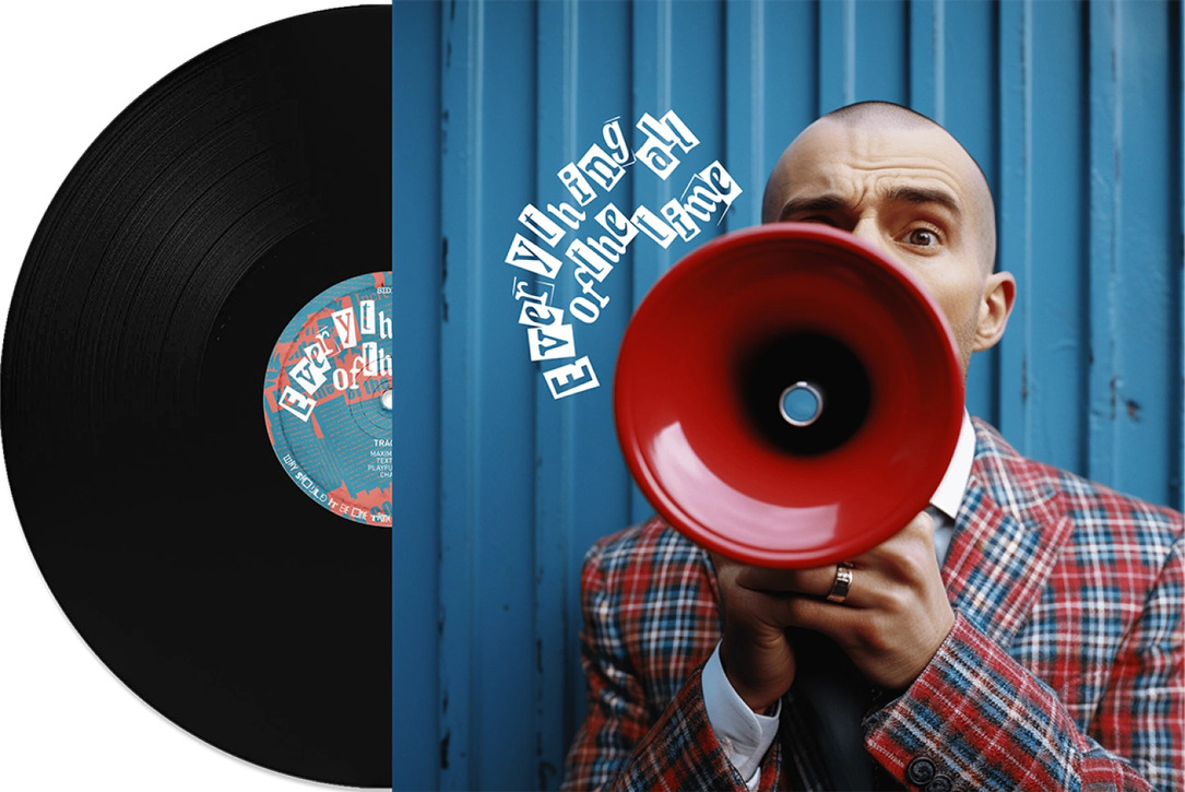
#1 Everythingallofthetime.
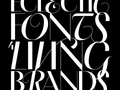
This first trend is all about maximalism, joy, limitless sources, inspiration, stimuli, colours, textures and of course typefaces. Designers are called to embrace the chaos, test the limits and get creative with it.
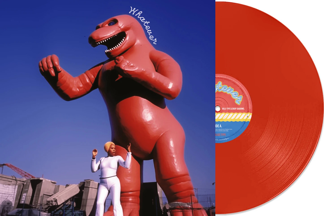
#2 Whatever.
Let’s go back to everyone’s favorite decade, the 1990s. From nihilistic grunge to vibrant pixel play, the resurgence of '90s aesthetics across various industries is more powerful than ever. From Nickelodeon’s revival of their iconic splat symbol to the Barbie frenzy taking over the internet, this wave of millennial nostalgia is dominating the creative industry for sure.
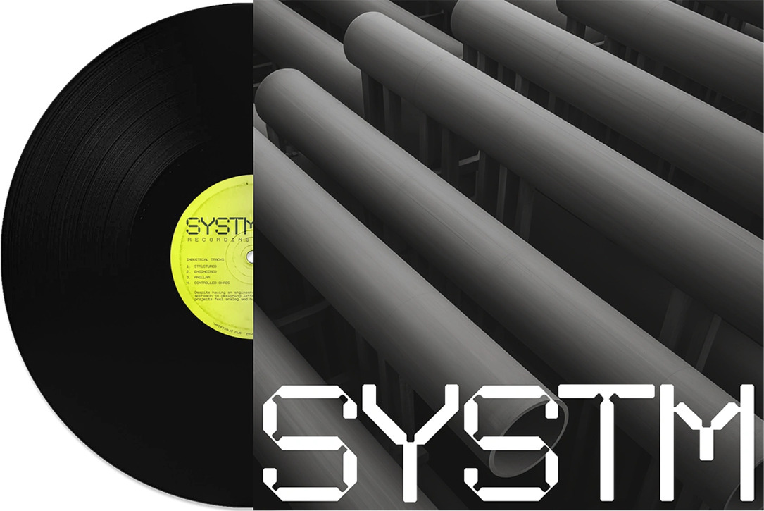
#3 Systm.
In contrast with trend #1, Systm brings it back to ‘structure, control, and precision’ and at the same time typefaces that evoke a sense of ‘analog and human-made’ qualities. It is what Martijn van der Does, Executive Creative Director of Amsterdam studio, WONDERLAND, calls Slow Design, ‘a reconsideration and even a return to traditional principles’, through mindfulness and thoughtfulness.
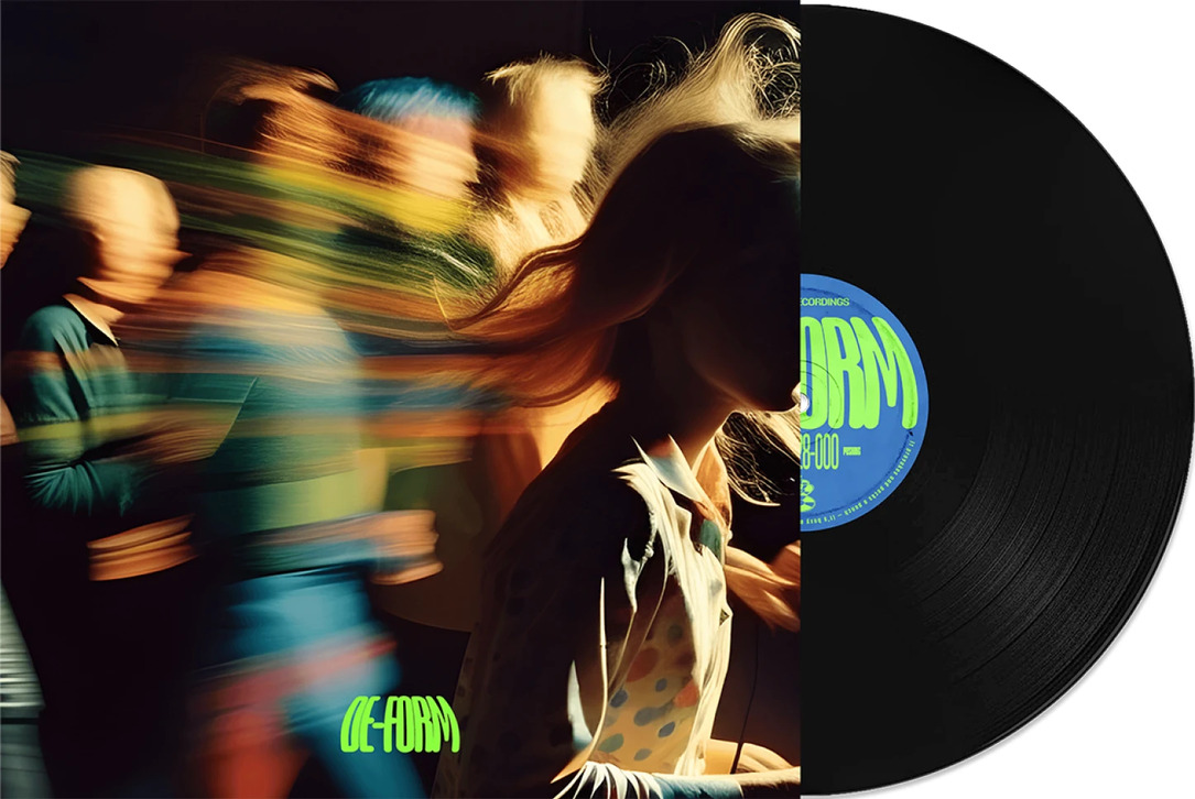
#4 De-form.
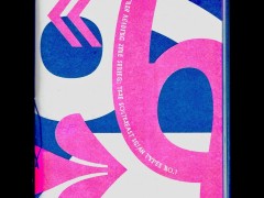
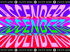
Time to ‘mistreat’ some typefaces. Designers are facing the challenge of doing the unthinkable: distort, skew and wrap their typefaces, without limits, fear, balance or proportion. ‘Maybe we need to break age-old rules to express a deep state of uprising after what we have collectively seen and experienced this year. The rebellion will be typeset!’.
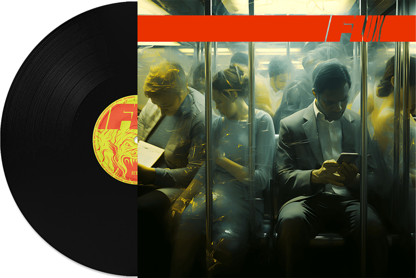
#5 Flux.
Flux is like a sub-category of De-form. It is on the move, dynamic, animated or static but inspired by motion and most of the times created through A.I.
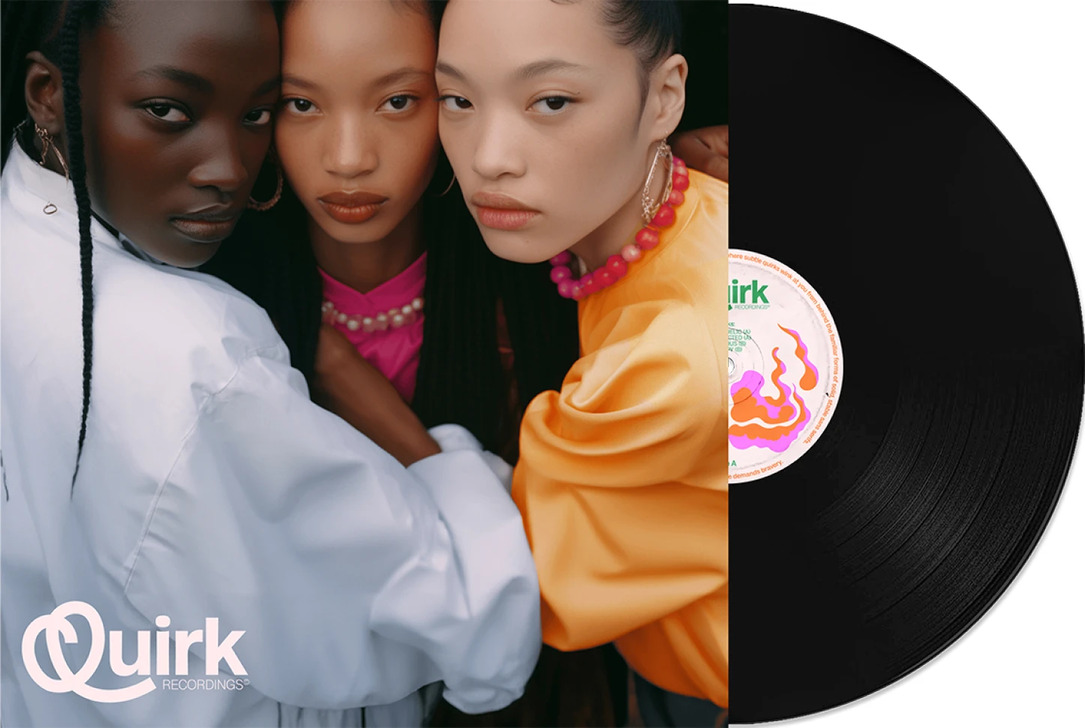
#6 Quirk.
A trend for the brave ones, the ones that dare to be bold and balance between chaos and comfort. Quirk is all about adding an over-the-top element that will catch the attention of the audience, but at the same time charm them with its subtle playfulness, without feeling strange or pretentious.
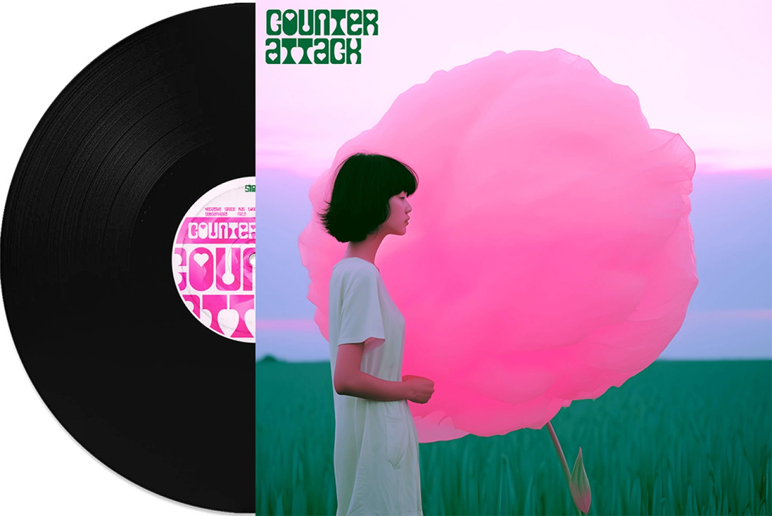
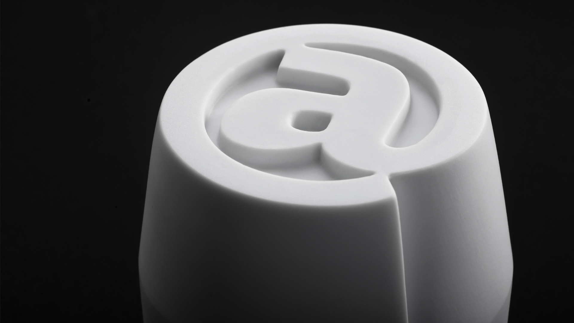
#7 Counter Attack.
It is time for the negative space to step onto center stage. This trend focused on the shapes inside each letter, their dynamic energy, ‘inner glow and a curvaceous joy’.
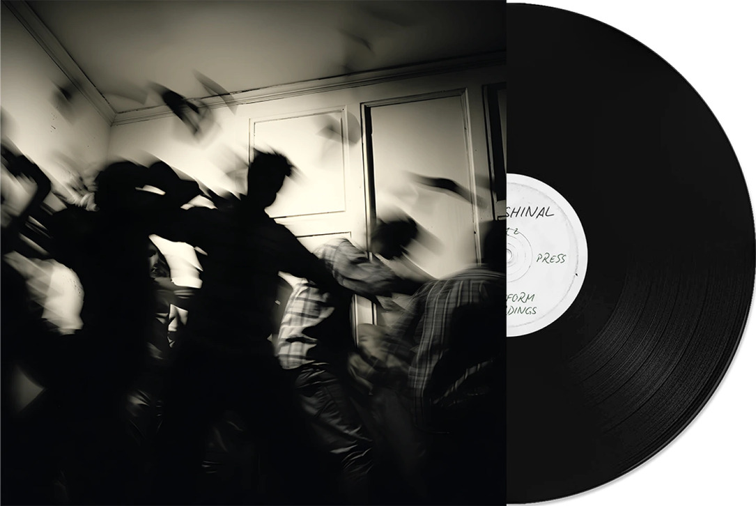
#8 Profeshinal.
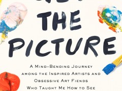
‘Naiveté within bounds’. Who said that professional means perfect? This trend is all about perfect imperfections, authenticity, childlike honesty, simplicity, humor and lightness. ‘As Picasso famously observed “It took me four years to paint like Raphael, but a lifetime to paint like a child”.’
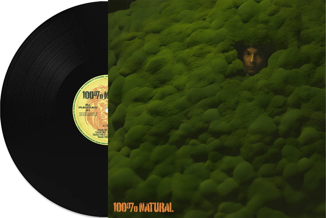
#9 100% Natural.
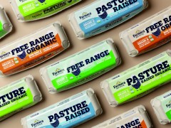
From sustainability, to morality, from crafts to natural elements, from organic to handmade, this trend could be expressed in various ways. What brings everything together, is a common axis of inspiration sourced from our environment and techniques that are raw, honest and emotional.
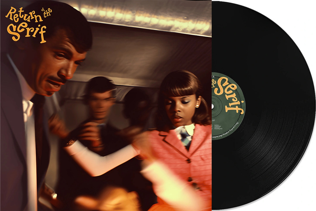
#10 Return of the Serif.
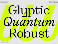
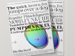
Bye-bye clean-cut sans serifs and Helvetica, it’s time for the serifs to make their come back, with their comforting sense of nostalgia and tradition and their ‘interesting duality, the ability to convey a demure and serious tone but equally a lighthearted and familiar embrace’.
Get your hands on the full report here.
Tags/ typography, graphic design, monotype, type trends

.jpg)

