
Memento: Craig Oldham, Pentagram, Sans Forgetica & more type to remember
On Sunday Design Museum collaborated with Event Communication on a very inspiring and playful theme, typography as memory. From the visual style for Memory Alexander McQueen exhibition in Prague at Centrum Chodov circa 2019 designed by Petr Kudlacek through Pentagram's Fragments mural installation with Martin Luther King words of wisdom at the National Center for Civil and Human Rights in Atlanta or Craig Oldham’s In Loving Memory Of Work, memory is made of type.
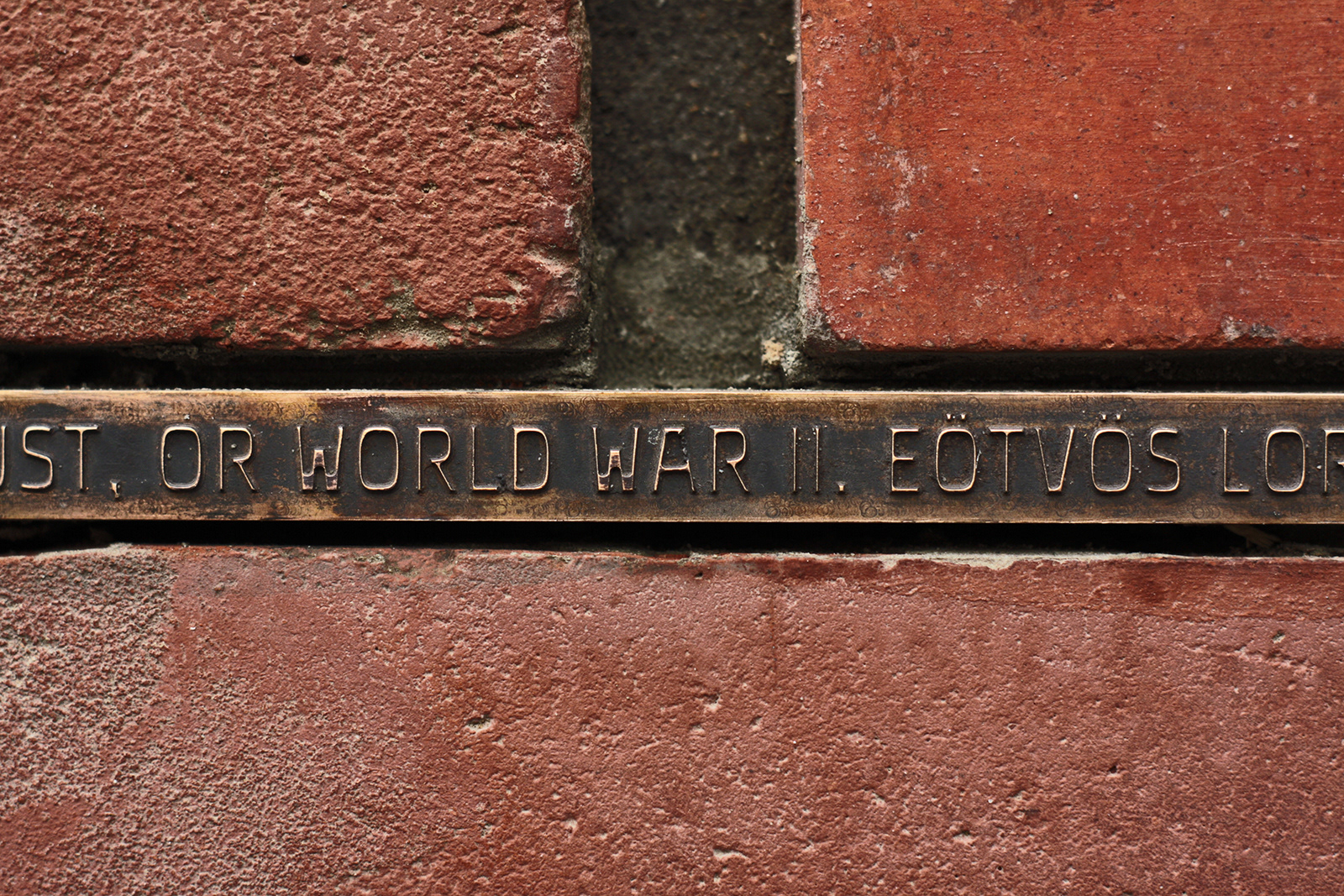
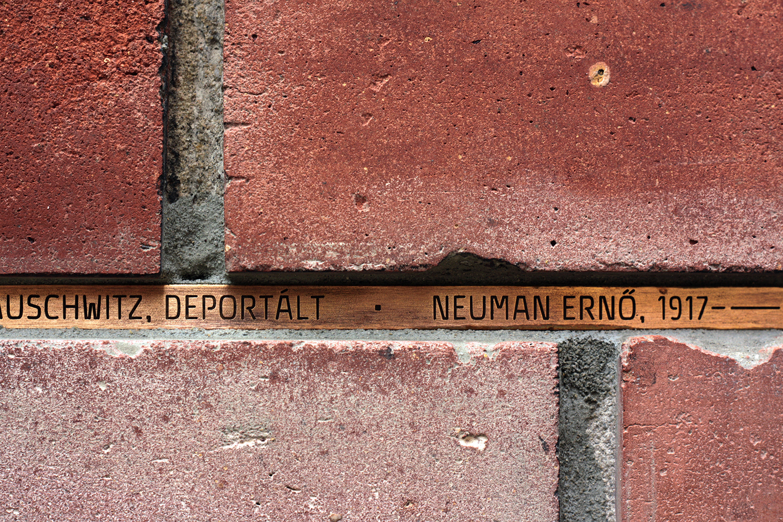
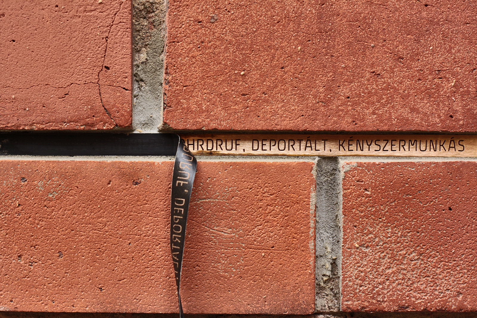
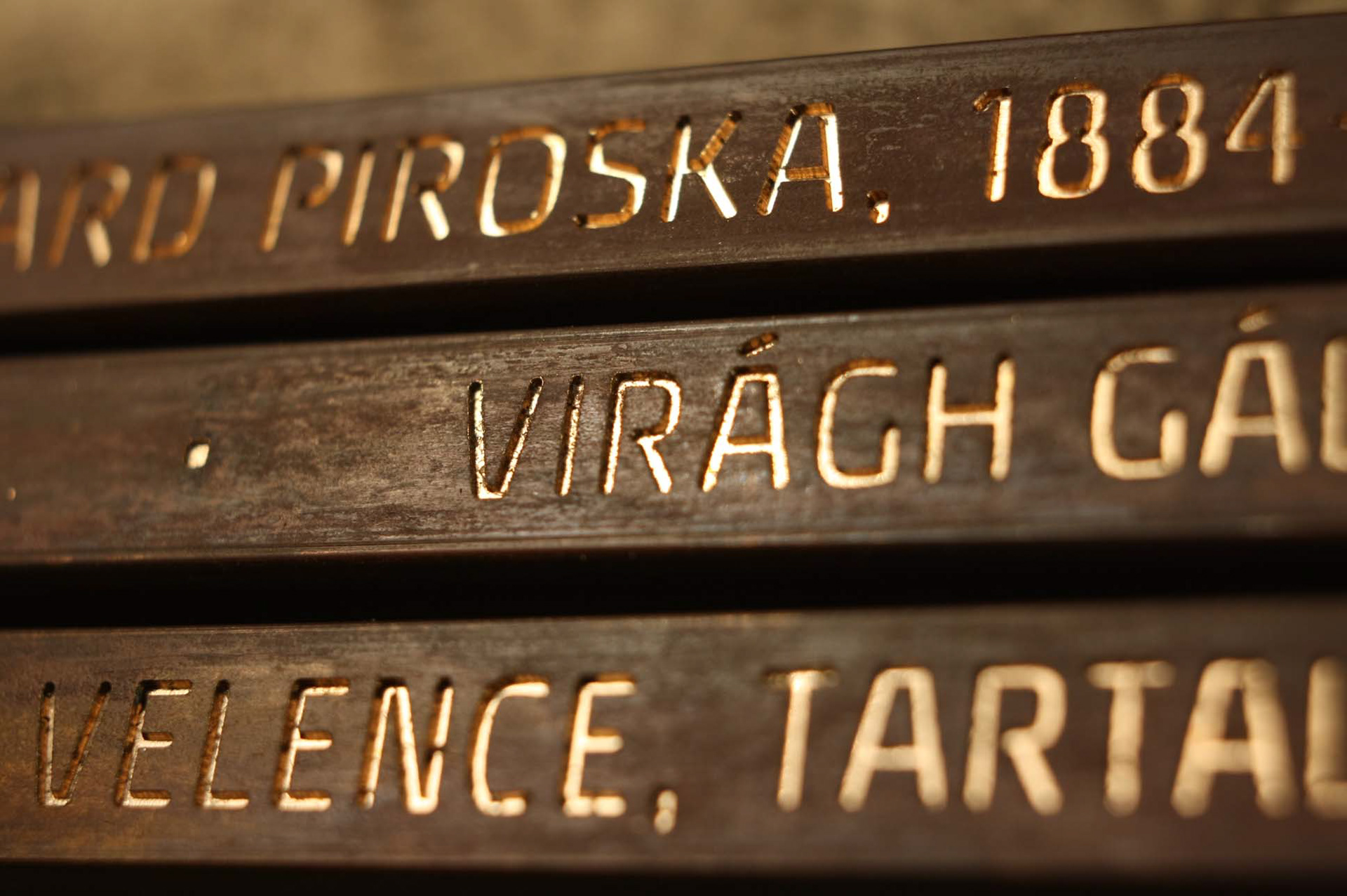
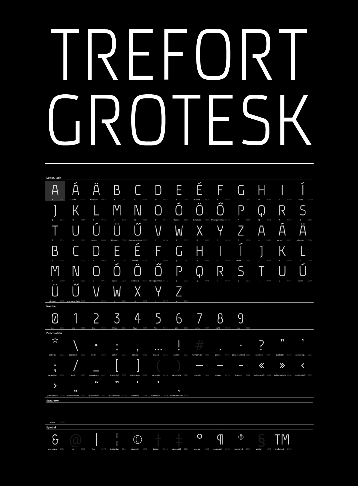
Fonts, literally, do not want us to forget who we are, type design is a tool for people to remember and this is more than evident in many projects which were featured in this week's #FontSunday. Here Typeroom highlights some of the most inspiring ones. Ákos Polgárdi's Trefort Grotesk custom font for a World War II monument at Eötvös Loránd University commemorating the university's students and professors who fell victim to the war is a fine example of the above.
“The names of the victims, along with their most important biographical data, were CNC-milled into bronze rods built into the facades of the school's buildings at its Trefort Garden campus” notes the designer. “The stripe is 1 cm in height and 200 meters in length, featuring the names of 198 victims in 9454 characters. 180 kg of bronze have been used. A number of formal limitations imposed upon the design process by the technique of milling strongly determined the typeface's character. As a result, Trefort Grotesk is a unicase, mono-line, condensed sans serif featuring open counters, some stenciled glyphs, and as few stroke joints as possible” adds Polgárdi who was responsible for designing various print collateral as well as the website of the project.
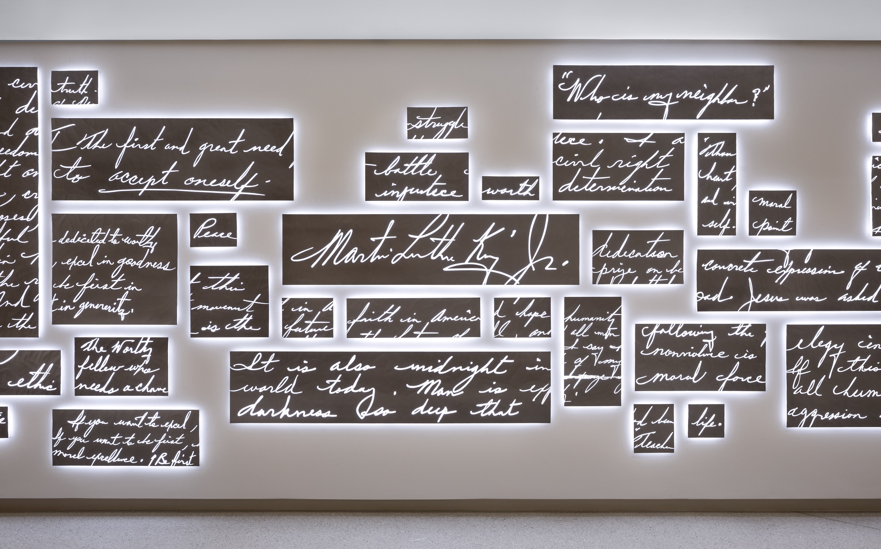
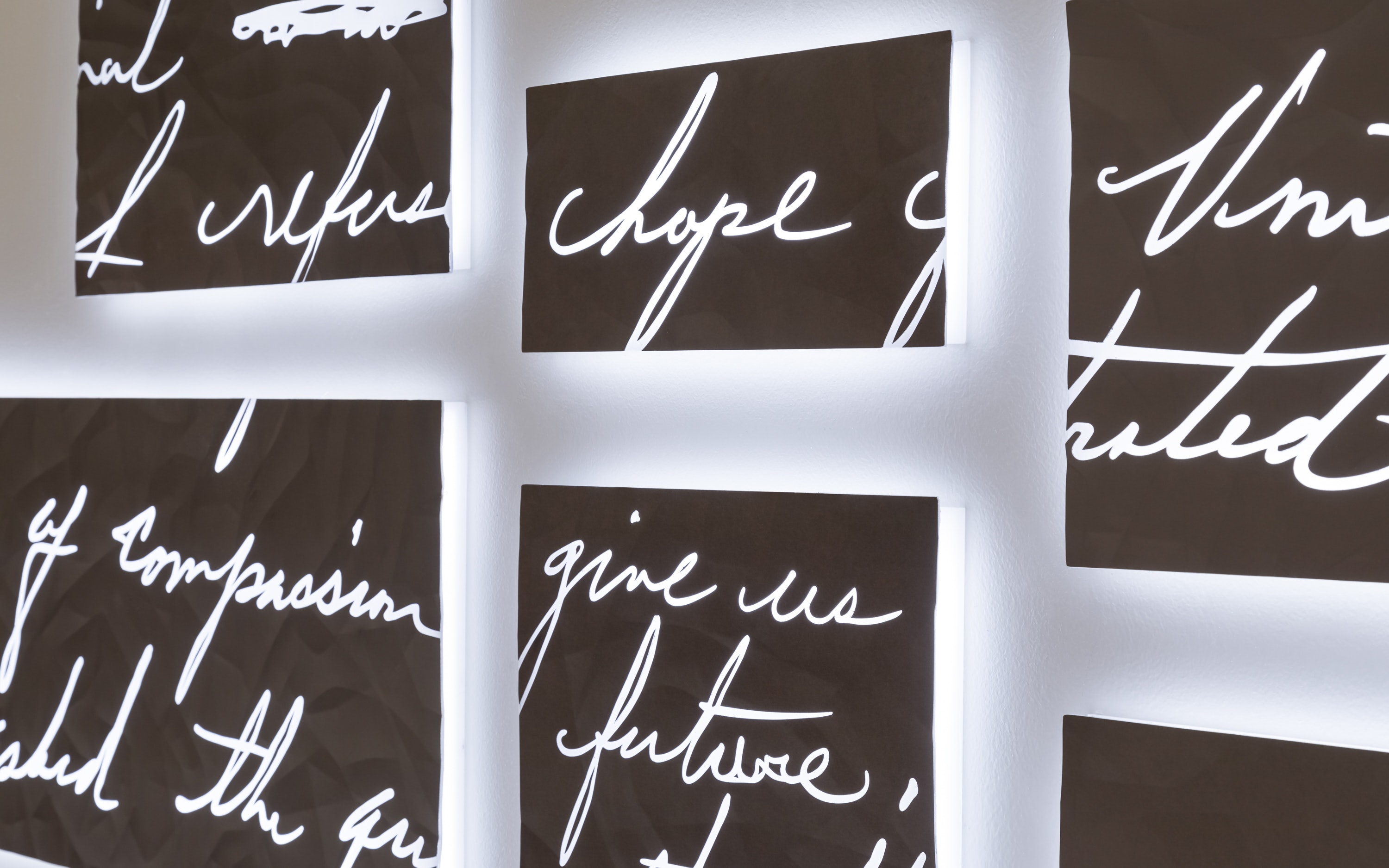
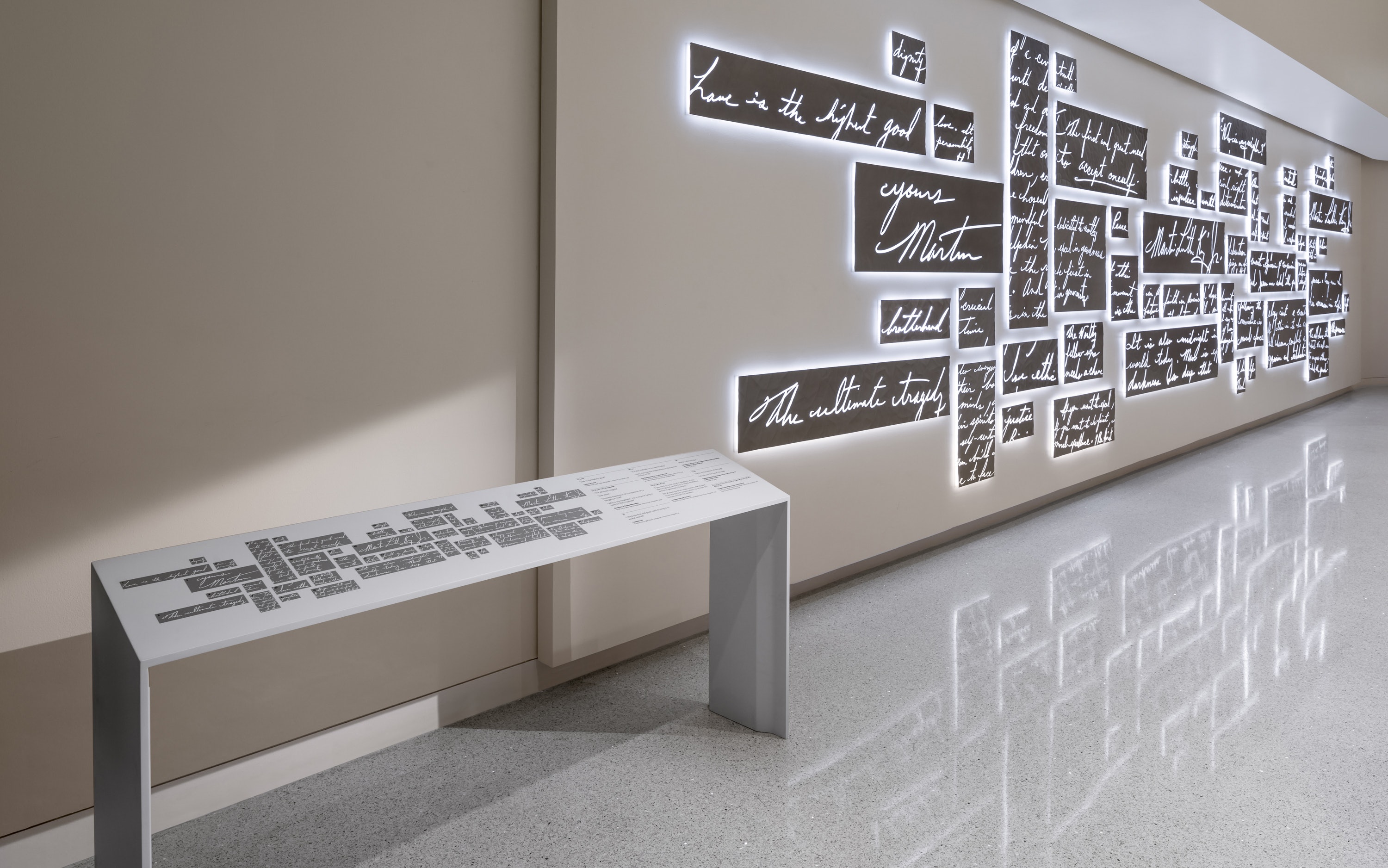
Another fine example of typographic elements that speak of history is Fragments, a permanent installation created by Pentagram for the National Center for Civil and Human Rights in Atlanta.
“Dr. Martin Luther King, Jr.’s wray with the written word, in the landmark speeches and sermons he wrote, was key to his impact as an orator and leader. These writings are highlighted in Fragments. The installation features passages from King’s handwritten speeches and letters, incised in metal and illuminated by light, showcasing the power, beauty and eloquence of King’s language and its importance to his message” notes Pentagram who worked closely with Lauren Tate Baenza, the museum’s Head of Content, on the installation, which welcomes visitors to the Center’s Voices to the Voiceless Gallery. The Fragments installation spans 38 feet and is constructed of 50 metal panels, laser cut to exactly match King’s handwriting and dramatically backlit to glow from within.
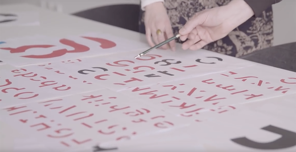
In Loving Memory of Work is Craig Oldham’s labour of love. Curated and designed by the designer himself, In Loving Memory Of Work marks the 30th anniversary of the miners’ return to work and is a vital re-appraisal of the collective aesthetic of one of most important social and political events in recent history. Bringing together myriad political graphics and cultural ephemera alongside first-hand testimonies, In Loving Memory of Work celebrates the creativity of the working class and is one amazing thorough visual record of Britain’s longest ever industrial dispute: the 1984-85 UK miners’ strike. Printed in the UK and published by Oldham’s own imprint (Unified Theory of Everything), the book’s high-production values are evident throughout. Oldham also collaborated with designer Aaron Skipper, to create a pair of unique, commemorative fonts for a publication that has a social cause (proceeds from the book will go towards the Orgreave Truth and Justice Campaign). 
“I’d come across the Liaison placards during my research and been struck with their distinct design and visual cut-through and decided to use that as inspiration and create a font for use in the book”
“Born in the mining town of Barnsley, just weeks after the formal end of the miners’ strike, it’s hard for me not to have been influenced by those events. After all, three generations of my family had worked in Barnsley pits. As I grew up, and as my parents and their community adjusted to the closures, it was impossible to avoid a certain amount of cultural fallout. Everyone, it seemed, had a story to tell. Funny, tragic, or just plain interesting, these stories (recounted by relatives, neighbours or friends) described the broader narrative of the miners’ strike—a narrative that, over time, created a curious backstory to my own life” explains Oldham.
“The book was started in late 2013 through a discussion with a friend of mine about the (then) upcoming 30th anniversary of the UK miners’ strike. As the project developed, I wanted to incorporate an honest and rooted design element in the fabric of the book rather than just showcasing the material. I’d come across the Liaison placards during my research and been struck with their distinct design and visual cut-through and decided to use that as inspiration and create a font for use in the book” he told Typeroom.
“In making the font, apart from starting the process, I art directed and drew the initial raw materials to act as a base for the full design. Then working with designer Aaron Skipper, we collaborated using Aaron’s experience in font creation to get the design to the final stage. There were some tricky decisions to make as obviously we didn’t have the full character and glyph set at our disposal to digitise so we had to employ a bit of creative license in essentially creating from scratch the numerals, glyphs, and certain characters. We also decided that hairline glyphs (which I’d used in a previous project, The Democratic Lecture, with the typeface Jean-Luc by Atelier Carvalho Bernau) would give the font a more contemporary edge and they also added to the unique personality of the font too. We named the font Liaison after the organisation who created the placards” notes Oldham of his typographic memory project which you can find here.


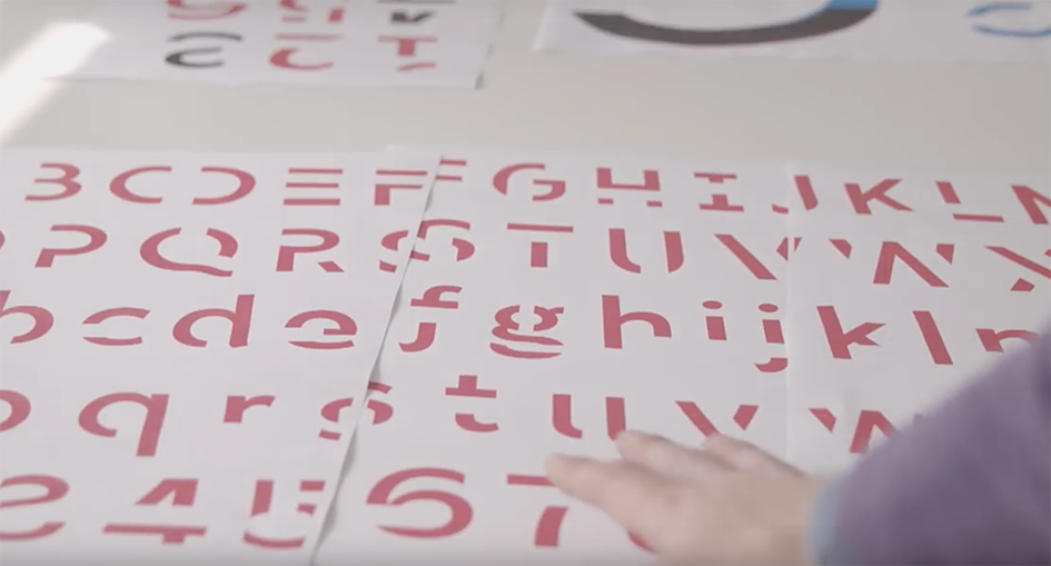
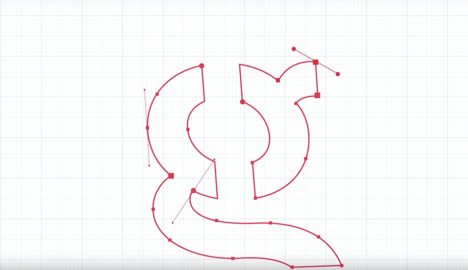
Memory is something we must preserve. Sans Forgetica is believed to be the world’s first new typeface specifically designed to help students recall information. It was developed by combining psychological theory and design principles to improve retention of written information" notes RMIT lecturer and renowned typographer Stephen Banham who worked with RMIT’s Behavioural Business Lab to test and refine a number of typeface designs for this groundbreaking project to create a typeface with optimal desirable difficulty for memory recall.
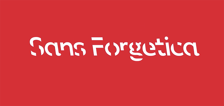
Sans Forgetica broke just enough design principles without becoming too illegible. The research proved it aids memory retention.
“The downloadable font is scientifically designed to help you remember your study notes" notes the campaign of the font designed using the principles of cognitive psychology to the youth of Australia. Created by a multidisciplinary team of designers and behavioural scientists from RMIT University Sans Forgetica is compatible with both PC and Mac operating systems. More difficult to read than most typefaces – and that’s by design the 'desirable difficulty' you experience when reading information formatted in Sans Forgetica prompts your brain to engage in deeper processing”.
“The font was developed using a learning principle called desirable difficulty, where an obstruction is added to the learning process that requires us to put in just enough effort, leading to better memory retention to promote deeper cognitive processing. Sans Forgetica has varying degrees of ‘distinctiveness’ built in that subvert many of the design principles normally associated with conventional typography. These degrees of distinctiveness cause readers to dwell longer on each word, giving the brain more time to engage in deeper cognitive processing, thus enhancing retention of that information” notes Banham on his blog.
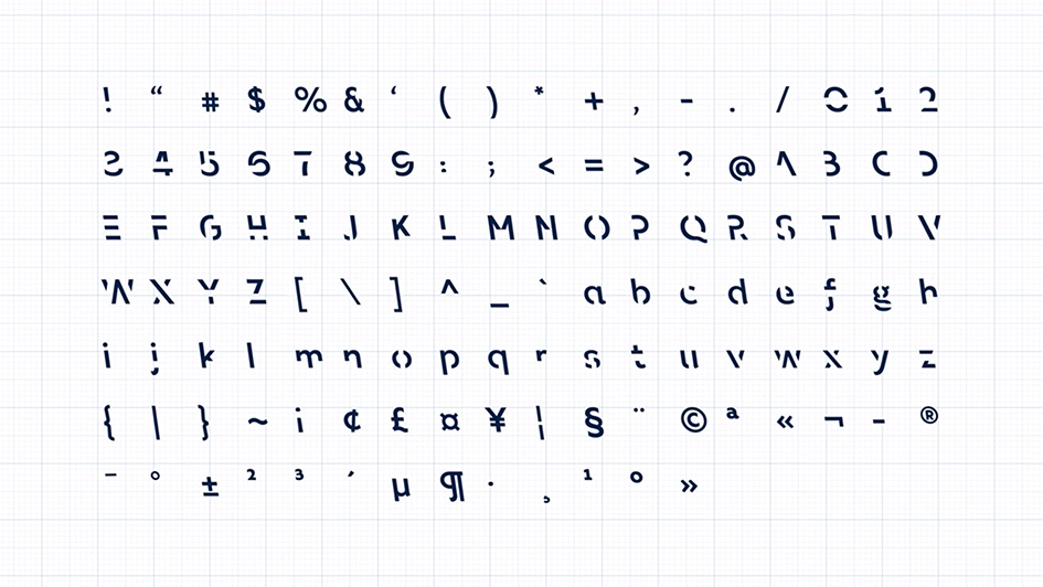
“About 400 Australian university students participated in a laboratory and an online experiment conducted by RMIT’s Behavioural Business Lab where fonts exhibiting a spectrum of obstructions were tested to determine which font led to the best memory retention. Sans Forgetica broke just enough design principles without becoming too illegible. The research proved it aids memory retention. As Dr Janneke Blijlevens, Senior Lecturer Marketing (Experimental Methods & Design Thinking), and founding member of the RMIT Behavioural Business Lab remarked “typical fonts are very familiar, so readers often glance over them and no memory trace is created. However, if a font is too different, the brain can’t process it and the information is not retained. Sans Forgetica lies at a sweet spot where just enough obstruction has been added to create that memory retention” he adds. The font is available free for download at sansforgetica.rmit


Images via Pentagram, Ákos Polgárdi, Petr Kudlacek, Sans forgetica and In Loving Memory of Work.
Tags/ inspiration, typeface, exhibition, book, installation, mural, fonts, pentagram, craig oldham, design museum, ákos polgárdi, martin luther king, sans forgetica, fontsunday, alexander mcqueen, petr kudlacek, world war ii


