An interview with Kevin Högger on his (very) Swiss typographic realm
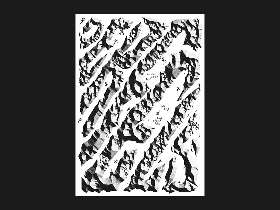
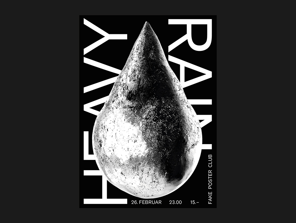
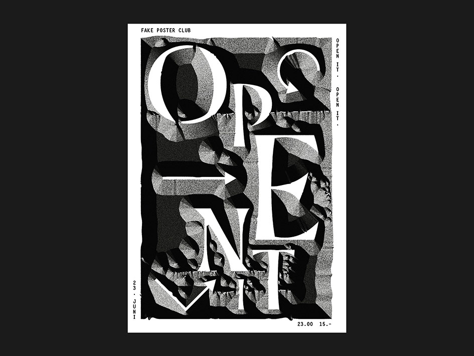
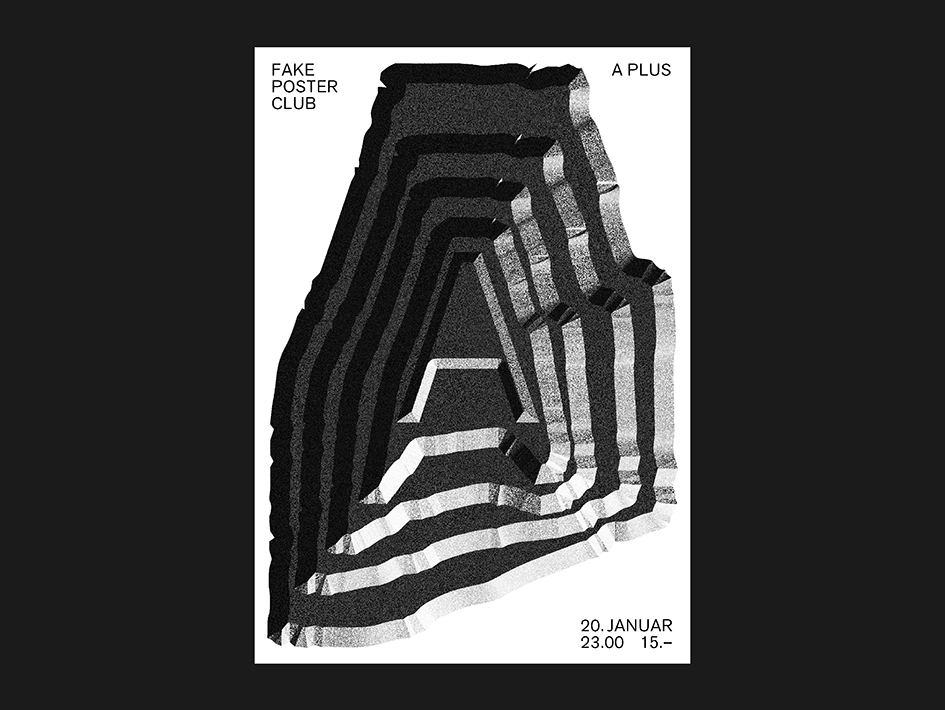
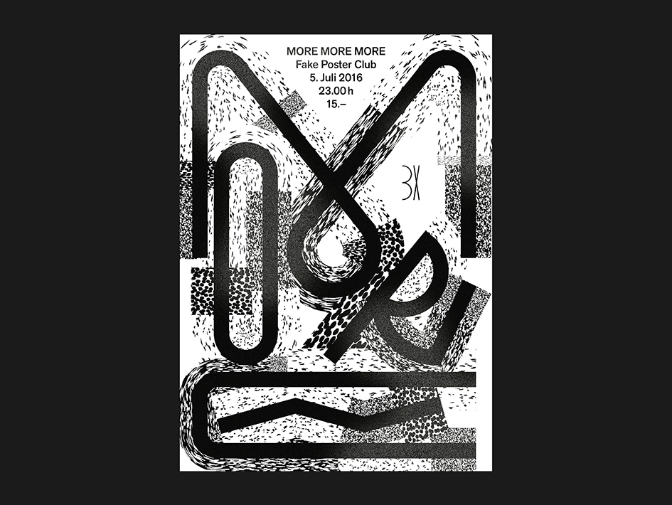
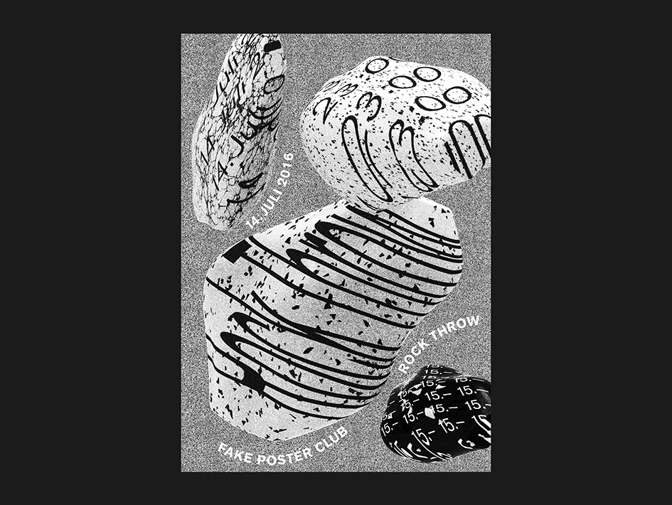
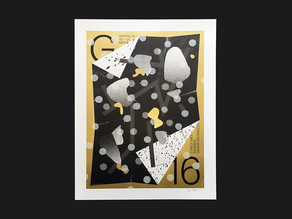
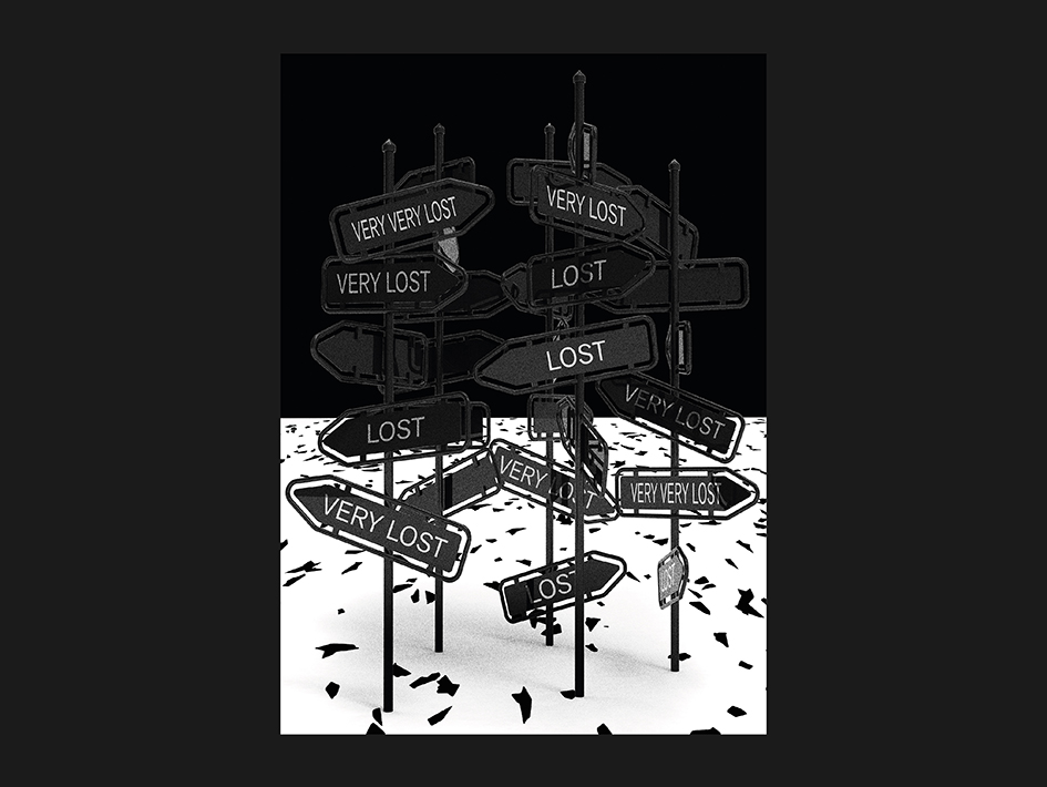
Kevin Högger has a legacy to follow. Or better yet, has a legacy to explore and evolve. A Swiss designer based in Zurich who manages to push the envelope in many, enchanting ways, Högger likes to experiment with digital and hand-drawn typography by repeating patterns and random textures in any format, from big posters to small objects. With a background in graphic and industrial design Högger tries to visualize his interest in materials and typography, surface and content, the minimalistic and the not so clean, flatness and the third dimension. We talked with him on his craft and we wondered “how did it all start?”
How did you decide to get involved with graphic design in the first place?
I loved to draw from a young age and my parents really encouraged it, often taking me to museums and exhibitions. For me, when I finished school a path into Graphic Design was the obvious choice. A friend of my mother took me to their office and I had the chance to see the daily life of a graphic designer – I was obsessed and that was it. The rest is history.
Who is the most influential typographer for you and why?
During my education in Zurich we learned a lot about Frutiger and Weingart. They're basically my childhood heroes. They influence my work a lot.
If you were a font which one would you be and why?
Ha! I think I would try to be a weird one on weekends and something Grotesque during the week.
My favorite font right now is Functional Grotesque by my friend Davide Rossetto, check out his work, its great.
Please name your three most precious letters.
I like a capital R, a minuscule e and every w. Letters where there is a Possibility to add a bit of swing and flow.
What is your first typographic memory?
Drawing balloon-type-titles for my classmates in school…
What is the one advice that you would share with any aspiring graphic designer out there?
As an aspiring graphic designer myself I don't know if I'm in a position to offer advice. Just keep creating and enjoy what you do I guess. Do stuff.
What are you up to at the moment?
The last few years I was really interested in ancient typography such as the Capitalis Monumentalis. I've been writing roman capitals with brush and ink for a while but now i'm trying to bring it to the screen. Beside that I am working on a few small branding-jobs and one or two ideas for products.
Which is your favourite magazine/newspaper that you enjoy? Which design elements you appreciate in these choices?
Victory Journal is one of my favorite printed products. It always has great stories and strong photography; there's fantastic people behind it. Online i check Ligature.ch from time to time.
Which project of yours have you enjoyed the most?
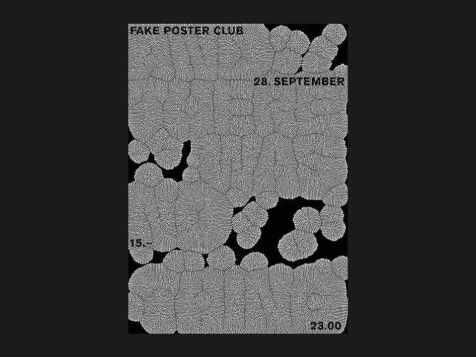
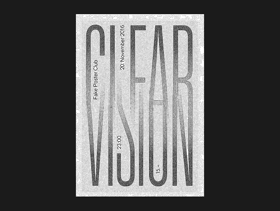
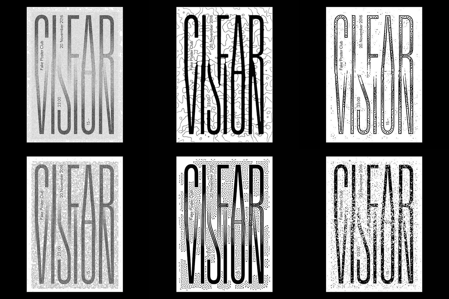
There have been plenty of 'cool' projects that I've been thrilled to work on. But I really enjoy the ones which offer something outside the traditional brief. The Poster-Series for Adidas was a favorite. There were so many great people involved; I really had complete design control which is so refreshing.
Which is the most valuable advice you were ever being given?
Better to work an hour more than an hour less on a project.
Your Instagram feed is a showcase of your portfolio. Please share with us the best instagram accounts one should follow for type inspiration.
There is a lot to see so go check my friends @sebastianmarbacher @tobiasbrunner @iviriver @samchirnside and then @boogypaper @spotyuno
Who are the most influential Swiss designers for you and why?
There's so much great design coming out of Switzerland but mostly i'm influenced by my friends and people I've had the chance to work with. Stephan Walter, Ruedi Zürcher and Oliver Schaich, Davide Rossetto, Chi-Long & Chi-Bin Trieu, Marlon Ilg, Piera Wolf, Harun Dogan just to name a few.
How has your background in industrial design influence your work as a graphic designer?
After working as a graphic designer for several years I decided to go back to University to study Industrial Design. I wanted to learn more about problem solving, conceptual thinking, new materials and three dimensional manufacturing. There's a lot to learn from the connections and differences between design disciplines.
What is the soundtrack to this conversation?
I can’t stop listening to this one: Bantu Clan vs Sarabi - Africa Ni Leo
Tags/ graphic design, faces, adidas, industrial design, frutiger, weingart, capitalis monumentalis, ancient typography, poster-series


